Primary Time (series)
Slow
|

Uncontrolled
|
Forgotten
|
|
Size: 21.6 cm. x 27.9 cm. (3)
Medium: Acrylic on Paper Completion: October 2018 |
This series addresses the passing speed of time relative to our personal interactions. This surreal concept is broken down into its subjective rates of motion, inspired by Salvador's interpretation of time expressed in Persistence of Memory. The structural components of shape and line are presented by sturdy, consistent color to enforce the way time is firmly, objectively measured as it continues, despite being subjectively experienced. The bold, simplistic style was inspired by the prints of Sassily Kandinsky.
|
Inspiration
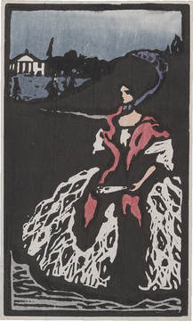
"Lady with a Fan" by Wassily Kandinsky (1903)
|
Sassily (Vasily) Kandinsky was an artist skilled in painting, water coloring, and printmaking. Simultaneously, he explored concepts of abstraction that were embedded into his artworks. The presence of color, line and shape became essential components in the construction of his pieces. From the beginning of his artistic development, he was influenced by the characteristics of abstraction and rejected realistic materialism as a way to depict his subject matter. I was inspired by his simplistic, expressionist styling approach of blocky, vivid colors. Boat Trip and Lady with a Fan are both woodcut prints by Kandinsky. They are both accented with black, following characteristics of German expressionism.
|
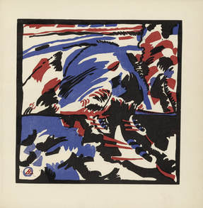
"Boat Trip" by Wassily Kandinsky (1913)
|
Simplistic, bold layers of color are used to depict details of the content. I wanted to incorporate solid, fluid hues into my work that did not utilize blending, like his prints, along with black as a base for forms. Many of his prints and other works became increasingly more abstract, where the content is almost indecipherable. While Lady with a Fan stands on its own as a print, Boat Trip is a part of a large set that decorated a collection of prose poems. Kandinsky's book Klänge (Sounds) began developing in 1907, and was composed of both poetry and fifty-six woodcuts that reflect his personal delve and transition of style. Boat Trip is characterized by its unaligned layering of red, blue and black that are extremely abstract. The use of line and shape are the basis of my creations as they were in the style of Kandinsky. However, while many of his later prints and paintings are heavily influenced by abstraction, I chose to characterize my own series more constructively with comprehensible and recognizable subject material. The most important part of Kandinsky's works was his desire to fuse together the arts as a whole -- where meaning stemmed from words, depictions, text and the space between everything. Abstraction drew together all the elements for him, and brought up theoretical concepts that characterized his thoughts and his art. I wanted to depict a concept rather than a scene.
|
The concept of the pace of time depicted in my work was inspired by Dali's Persistence of Memory, as I found myself drawn to the speed of passing moments and moments of dissociation. Dali was a famous Surrealist, known for his themes and subjects that encompassed intangible existences and experiences. This painting in particular boldly addresses the presence of time in his own personal life, and the way her perceived its change. There is a contrast of time being elastic and flexible, or hard, as depicted by the melting clocks. It approaches time through the lense of sleeping, and the way time become warped in our minds as we cross over the boundaries of consciousness. I was inspired by his interpretation of time and the contrast created. A more prevalent experience in my life is the speed of time: slowing down, speeding up, stopping, or becoming dissociated from it all together. This is the subject of my work -- time speed.
|
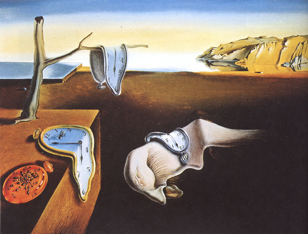
"The Persistence of Memory" by Salvador Dali (1931)
|
Planning
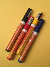
My very first planning sketches were produced on different people, at different times. The people we spend time around tend to heavily influence how time passes for us, and how it feels. So when I noticed time passing at a certain rate, that's when I stopped to make the sketches. Acrylic paint markers were used.
Slow.
|
Disassociation, lose track.
|
Fast,
|
Chaotic,
|
Overwhelming.
|
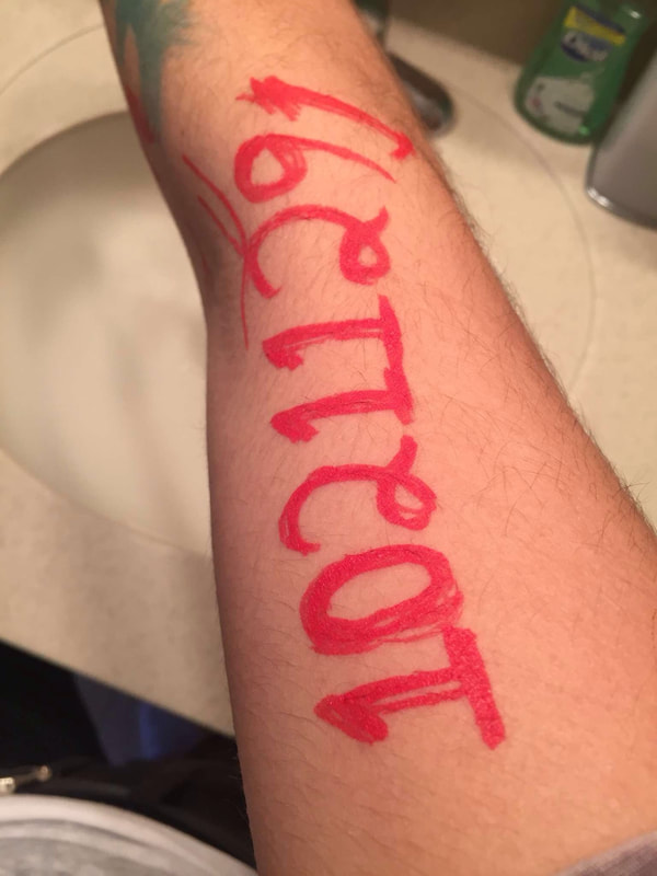
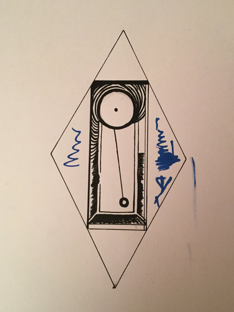
To produce a permanent set of planning sketches, I quickly photographed the temporary work (above) I created on others to document my work before having to depart, and then proceeded to recreate them free-hand on paper with sharpie markers later on.
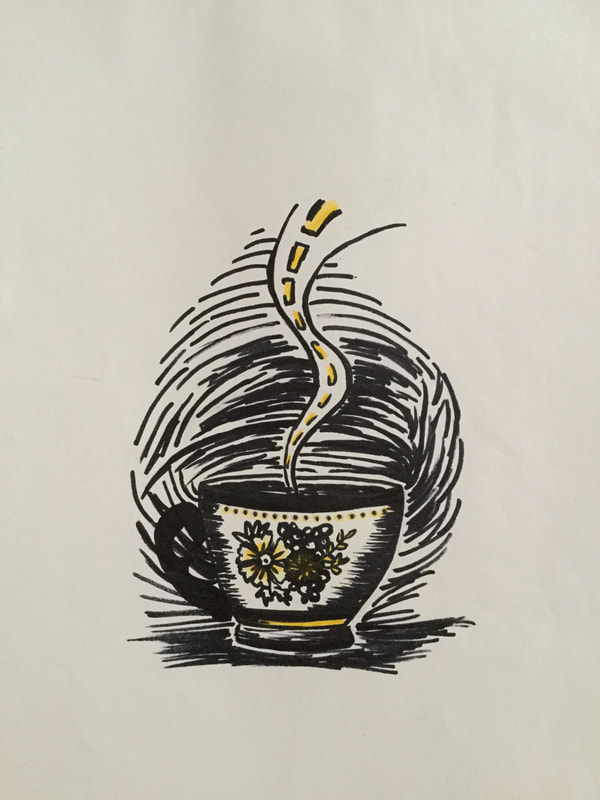
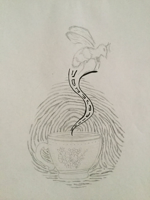
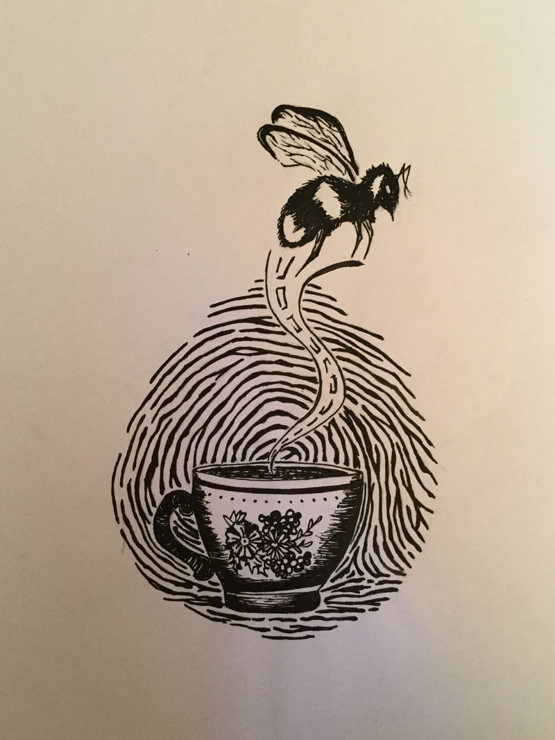
Planning 1 (Slow Time) addresses the experience of time slowing down and becoming slugged. Incorperated elements encompass slow experiences or relaxing concepts. Soft, organic shapes and line construct enhance effect.
|
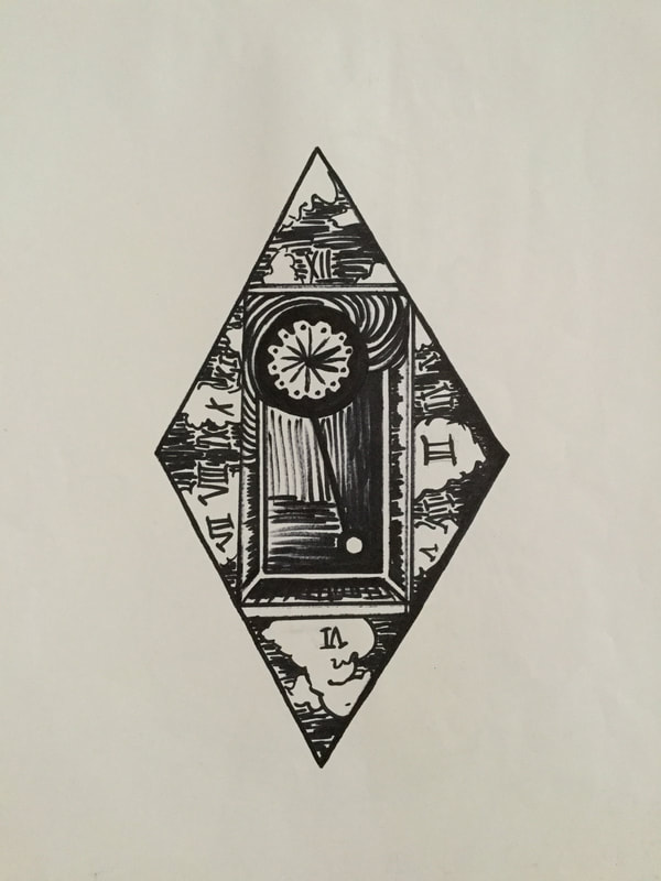
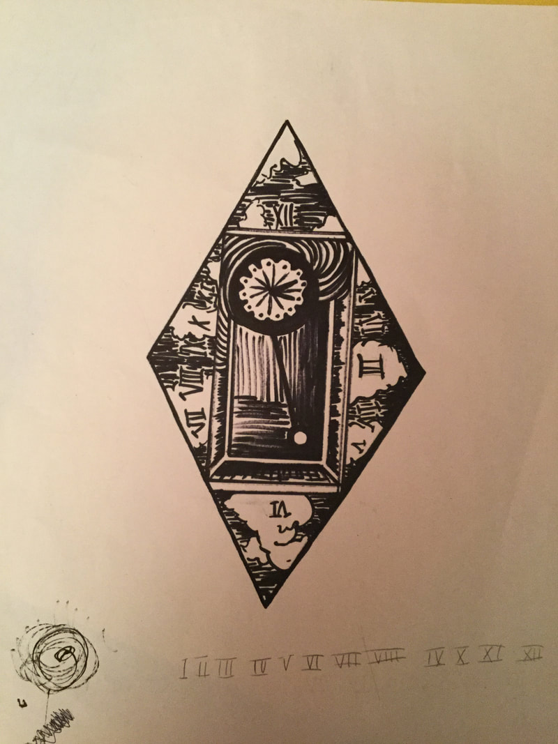
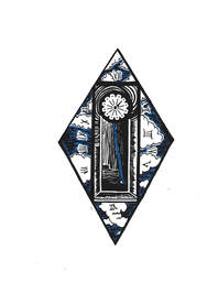
Planning 2 (Forgotten Time) addresses the experience of time standing still or just existing -- with or without the thought being prevalent. Incorperated simple elements of human life that are shared such as time-telling, the sky, and more rigid, defined shapes.
|
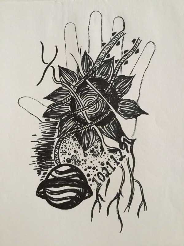
Planning 3 (Fast, Uncontrolled Time) addresses the experience of time whirling, speeding up. The chaos of thought that preoccupies the mind and allows time to pass without knowledge. Various line types are blended for a more chaotic effect; an assortment of numbers, shapes, and space concepts depict the overwhelming experience & confusion.
|
Process, Technique & Experimentation
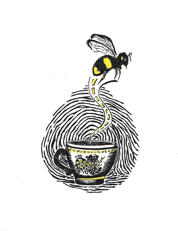
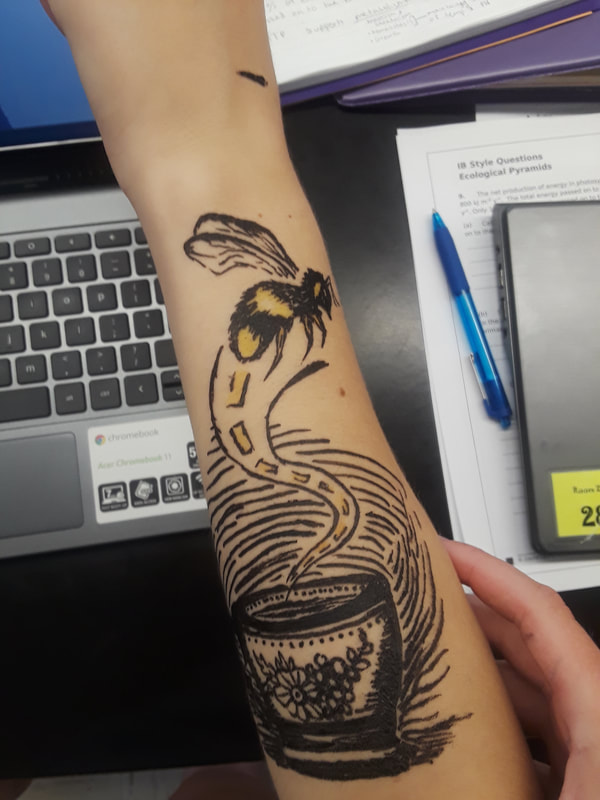
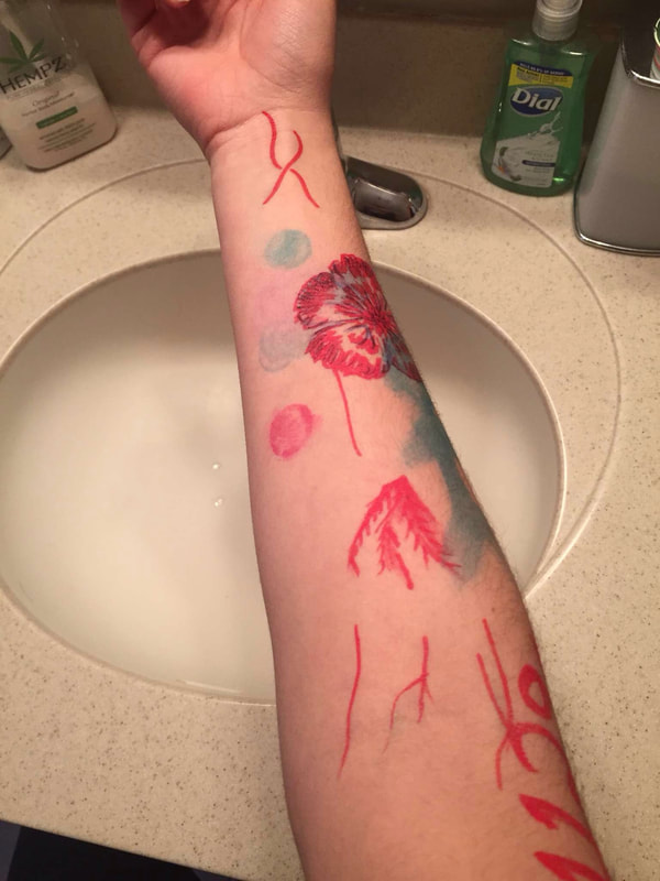
The process of this project began with the planning sketches that I created on others with acrylic markers. My creativity flows better when I draw on people, because the marks are never permanent and there is always another arm or hand. In a moment when time was passing extremely slow, I drew the design that reflected it. The subject matter mimics the concept of slow time within the human experience. We witness bees move slowly and lazily during the heat of summer, long winding roads take a long time to cross, and hot, steamy tea that is often associated with relaxing. It represents the slowly moving mind.
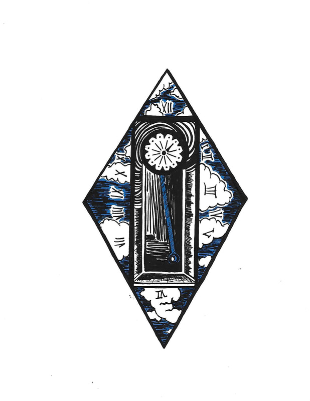
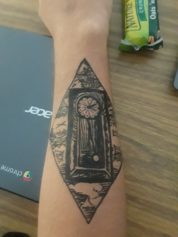
When I was with someone who tends to have a presence that disassociates life from time, I drew out the concept on them. Time is contained within a box, a grandfather clock, but the actual time reflected in numerals floats beyond its normal containment. The thinly curved lines curling around the clock face present a calmative effect and resemble a hypnotic experience. Forgetting the presence of time in our lives every now and then is a universal experience that takes place in every mind on earth under the sky -- which is represented by the clouds. This piece is characterized by more firm, defined shapes (circles, rectangles, diamonds) as they resemble the precise structure in which humans have characterized the measurement of passing time.
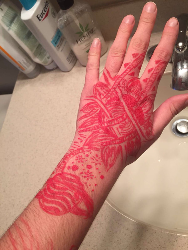
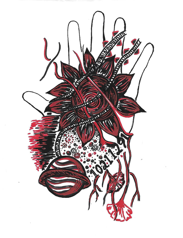
When I was with someone who made time speed up and made my thoughts build more quickly, I drew on them how it felt. It is a more complex collage of items, with elements of space, time, numbers, thoughts, and nature. Chaotic line use constructs the content with varying width, curvature and rigidity. It reveals the spinning thought process and creativity, and the presence of time moving very quickly. Being in the moment when I made them inspired each representation of time. After creating these, I took photos. I was then able to recreate them on paper later on as a final, permanent planning sketch.
After the initial ideas were produced, a few changes and additions were made. In the Slow Time piece, as I looked at the line detail sketched around the tea cup I began to see more of a fingerprint design. I wanted to recreate this in order to more clearly represent it. The fingerprint provides a human element to the interpretation of time. In the Fast Time piece, I wanted to further incorporate elements from the original. Drooping flowers were integrated into the veins in the bottom right corner that stem from the list of numbers.
When I was with someone who tends to have a presence that disassociates life from time, I drew out the concept on them. Time is contained within a box, a grandfather clock, but the actual time reflected in numerals floats beyond its normal containment. The thinly curved lines curling around the clock face present a calmative effect and resemble a hypnotic experience. Forgetting the presence of time in our lives every now and then is a universal experience that takes place in every mind on earth under the sky -- which is represented by the clouds. This piece is characterized by more firm, defined shapes (circles, rectangles, diamonds) as they resemble the precise structure in which humans have characterized the measurement of passing time.
When I was with someone who made time speed up and made my thoughts build more quickly, I drew on them how it felt. It is a more complex collage of items, with elements of space, time, numbers, thoughts, and nature. Chaotic line use constructs the content with varying width, curvature and rigidity. It reveals the spinning thought process and creativity, and the presence of time moving very quickly. Being in the moment when I made them inspired each representation of time. After creating these, I took photos. I was then able to recreate them on paper later on as a final, permanent planning sketch.
After the initial ideas were produced, a few changes and additions were made. In the Slow Time piece, as I looked at the line detail sketched around the tea cup I began to see more of a fingerprint design. I wanted to recreate this in order to more clearly represent it. The fingerprint provides a human element to the interpretation of time. In the Fast Time piece, I wanted to further incorporate elements from the original. Drooping flowers were integrated into the veins in the bottom right corner that stem from the list of numbers.
|
|
|
|
As I recreated the planning drawings with various changes, I would first approach the design with pencil to some or all of the components as a guideline. Some dimensions were changed to be larger/smaller/wider/thinner for a better effect. I then went back and traced over the pencil with acrylic marker. They were all traced in black as an accented foundation. After the final products were made, I chose one of the three primary colors and went back to highlight portions and add the presence of a bright hue. Areas left blank were filled in with color, and many of the black lines were traced to the side by another hue so that the colors overlapped. Nearly all pieces required at least three recreations in order to finalize and conceptualize the desired outcome.
Reflection
This series of artworks was a very different approach and heavily leaned on experimentation. I utilized acrylic paint markers for the first time and discovered how bold and crisp of a line the paint made when limited to such a small form of release. However, this did not derive from the medium itself. As I began the process of reconstructing and reproducing the original planning sketches (made with perminant marker), there were a couple instances in which the paint bled more heavily and accidentally came into contact with my hand, or was smudged by the use of a ruler and bled underneath. It was much more accident-prone than ink. Each piece took a couple repoduction attempts in order to create a clean image and avoid all smudging mistakes. The most difficult aspect was patience and having to start over sometimes. However, I was able to experiment with line use abundantly within this piece, which proved to be very interesting as I do not often break my creations down into line or shape. I was pleased with the way this series of three turned out, and I would like to make more in the future.
Primary Time (Series)
|
Compare & Contrast
Similarities
|
Kandinsky's Work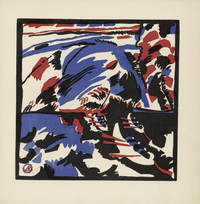
"Boat Trip" by Wassily Kandinsky (1913)

"Lady with a Fan" by Wassily Kandinsky (1903)
|

ACT Responses
Clearly explain how you are able to identify the cause effect relationship between your inspiration and its effect on your artwork?
I am able to identify the cause-effect relationship between my inspiration and its effect upon my artwork by analyzing the intentional use of specific shades of color (black, red, and blue) to unify and simplify the portrayed content, allowing for a degree of abstraction.
What is the overall approach the author has regarding the topic of your inspiration?
Kandinsky's approach to his woodcut prints was to simplify concepts and subject matter as abstractly as possible; his creations are dominantly composed of organic shapes and lines in smooth, consistent color. Dali utilized precise subject matter to conceptualize surreal sensations and display unusual experiences that humans uniquely encounter.
What kind of generalizations and conclusions have you discovered about people, ideas, culture, etc. while you researched your inspiration?
Due to the abstract nature of the emotions that are produced by the experience of intangible aspects of life, surrealism is characterized and symbolized visually in different ways. Dali was able to interpret time as a concept that had consistency (could fluctuate between hard and soft).
What is the central idea or theme around your inspirational research?
The central idea of my inspirational research was the use of a simplistic, more abstractly-inclined style. The nature of prints allow for color to remain consistent in saturation and intensity, an approach that dominates Kandinsky's woodcut prints.
What kind of inferences did you make while reading your research?
Kandinsky's focus on the presence of color and the placement of visual elements creates an aesthetic that is not always focused on depth or meaning, but more so on the visual experience and the pleasing characteristics of the work itself.
Bibliography
- “Wassily Kandinsky Most Important Art | TheArtStory.” The Art Story, www.theartstory.org/artist-kandinsky-wassily-artworks.htm.
- “Vasily Kandinsky. Boat Trip (Kahnfahrt) (Plate, Folio 28) from Klänge (Sounds). (1913).” MoMA, www.moma.org/s/ge/collection_ge/artist/artist_id-2981_role-1_sov_page-68.html.
- Dalí, Salvador. “Salvador Dalí The Persistence of Memory 1931.” MoMA, www.moma.org/collection/works/79018.
- “Lady with a Fan.” Guggenheim, 9 Oct. 2018, www.guggenheim.org/artwork/1828.
- https://www.moma.org/s/ge/collection_ge/artist/artist_id-2981.html
