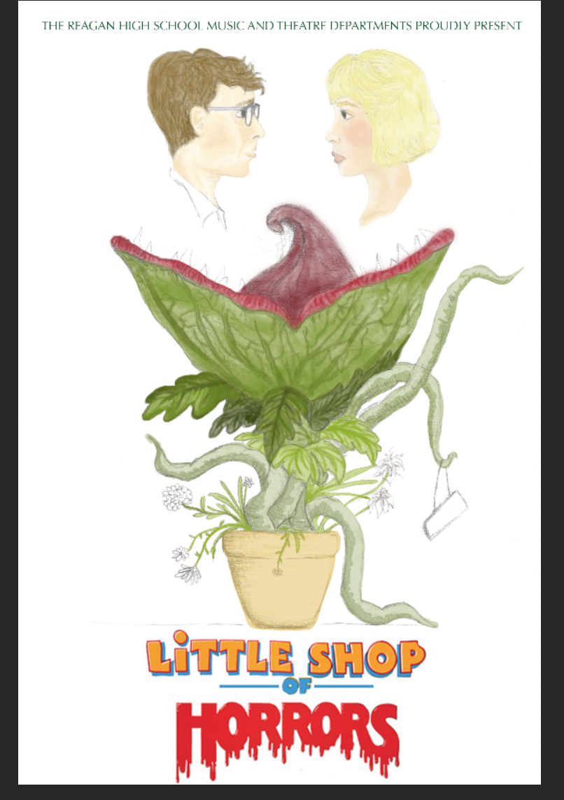
Ronald Reagan High School Presents: Little Shop of Horrors
|
Size: 24 in. by 36 in.
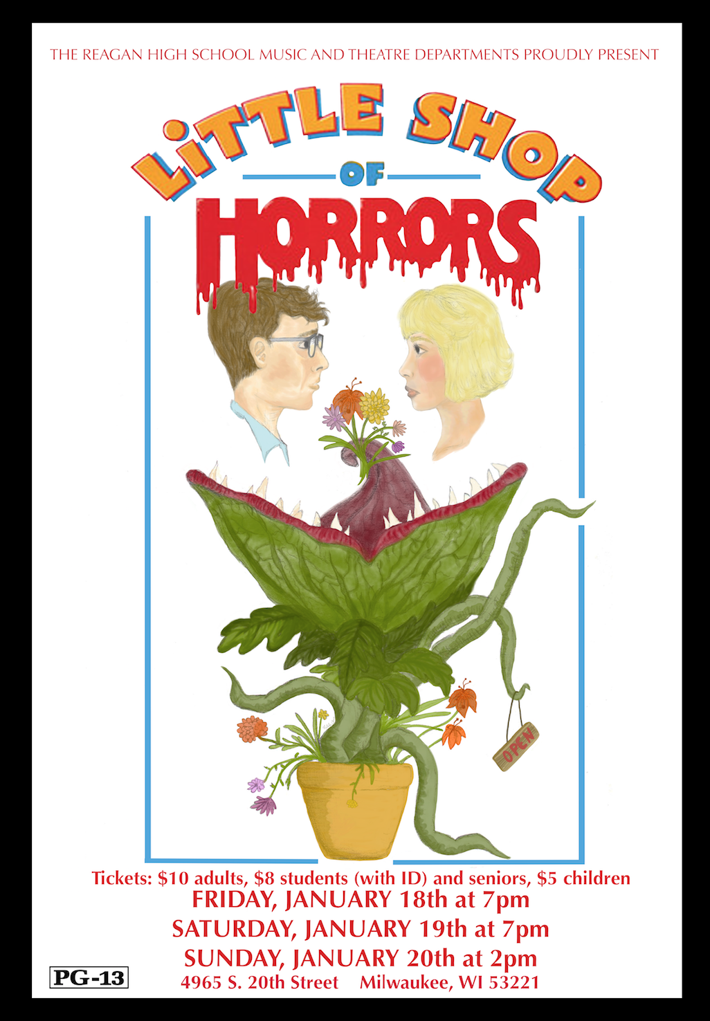
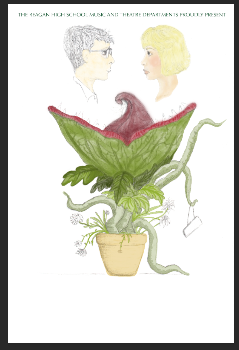
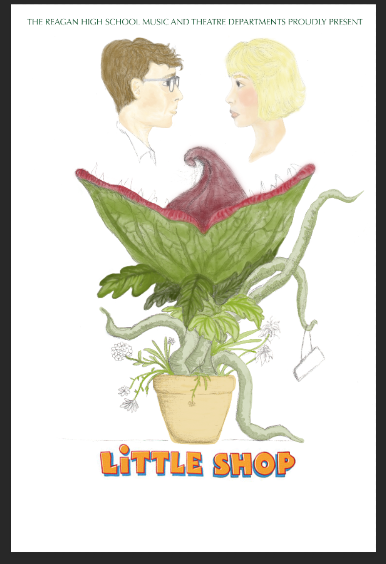
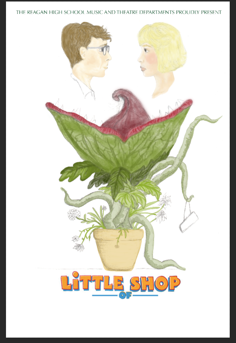
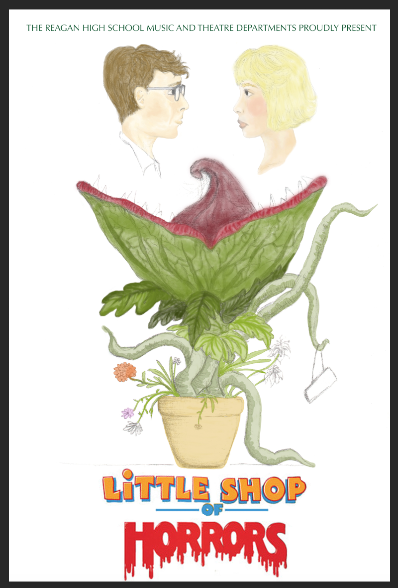
Medium: digital illustration Completion: November 2018 This year, the IB Theater program is doing a production of the musical, Little Shop of Horrors. I was intrigued by the content and decided to collaborate with them. Being a student in IB Visual Arts, I worked in cooperation with their program to create a poster for the musical. It combines elements of the plot in a simplified display of advertisement, inspired by the human sketches of Leonardo da Vinci and the colored illustrations of Leonard Weisgard for the book, Alice In Wonderland. Use of the original "Little Shop of Horrors" logo design is permitted by purchasing and owning the rights to the production for the use of the Ronald Reagan High School musical performance. |
Inspiration
This year, the IB Theater program is doing a production of the musical, Little Shop of Horrors. I was intrigued by the content and decided to collaborate with them. Being a student in IB Visual Arts, I worked in cooperation with their program to create a poster for the musical. It combines elements of the plot in a simplified display of advertisement, inspired by the illustrations of Leonardo da Vinci and the colored illustrations of Leonard Weisgard for the book, Alice In Wonderland.
|
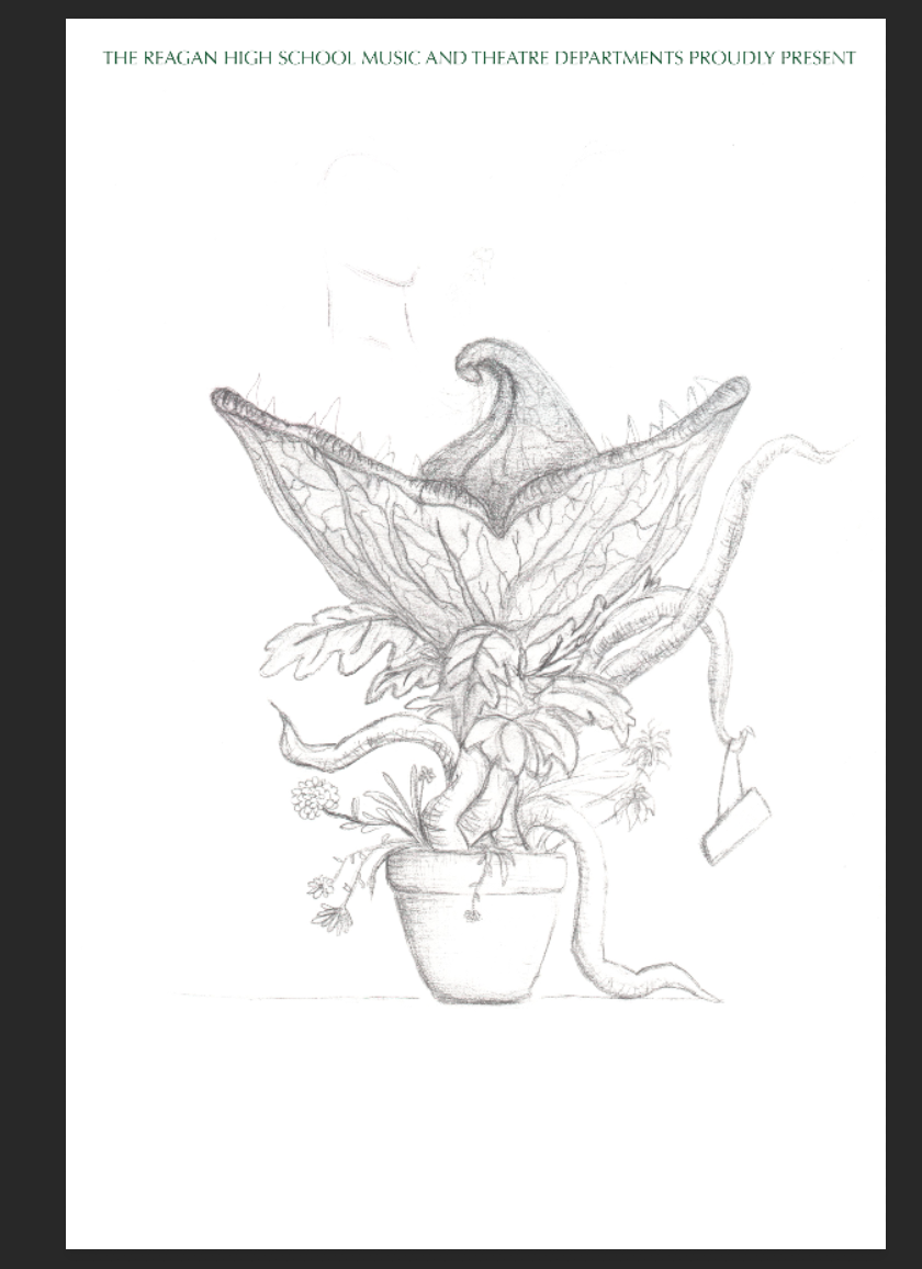
Leonardo da Vinci was a highly important figure of the Italian Renaissance. His skill set was extremely broad, his mastery encompassing architecture, sculpting, painting, drafting, anatomy, and various aspects of scientific study. Throughout his life, his interests fueled his desire to fill notebooks with observational and theoretical illustrations. His sketches include the anatomy of humans and various animals, portraits, and other concepts. His observations guided his drawings. Da Vinci's approach was rather simple, but constructed more complex or shaded images through use of simple mediums, such as chalk. I was inspired by his technique of illustration to construct my own figures and content. His approach is mainly to mimic a realistic portrayal. With minimal, natural colors, he uses shading to emphasize the shape and two-dimensional elements of a face. The content of my poster incorporates components of the musical itself, including the plant (Audrey II), Seymour, and Audrey. Inspired by da Vinci's technique, the foundation of my poster was created through sketch work and light shading in areas.
|
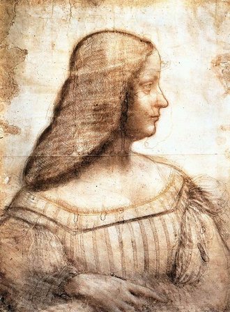
"Portrait of Isabella d'Este" by Leonardo da Vinci (1500)
|
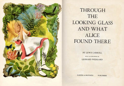
Leonard Weisgard created a new set of illustrations for the story of Alice In Wonderland as well as Through The Looking Glass And What Alice Found There in 1949. His artwork is characterized by vibrant, rich colors and textures. While some colors are more reserved and pastel, others are playful and bold. Mimicking the nature of the content, he creates childish arrangements of subject matter.
|
|
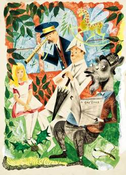
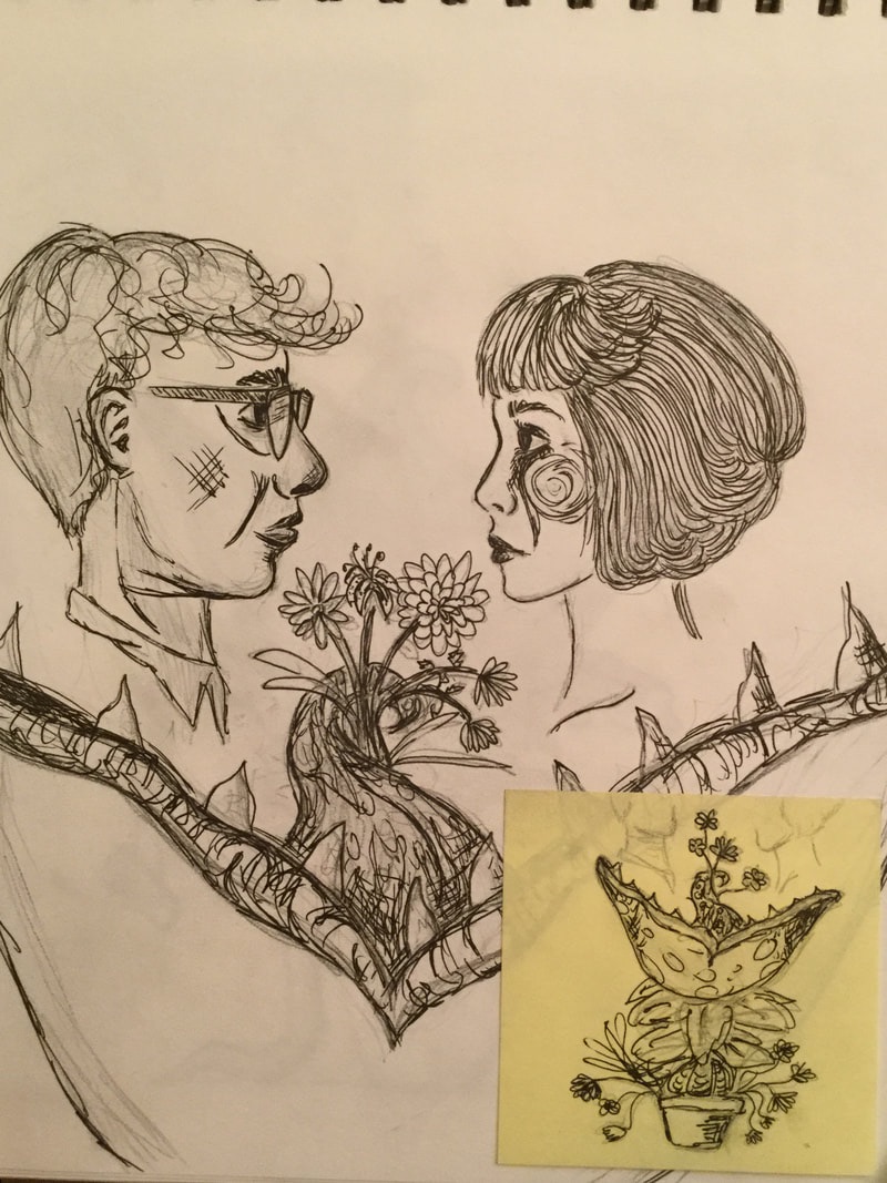
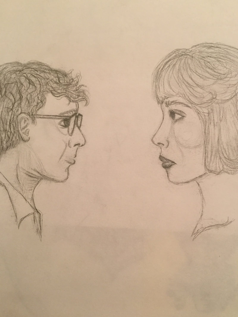
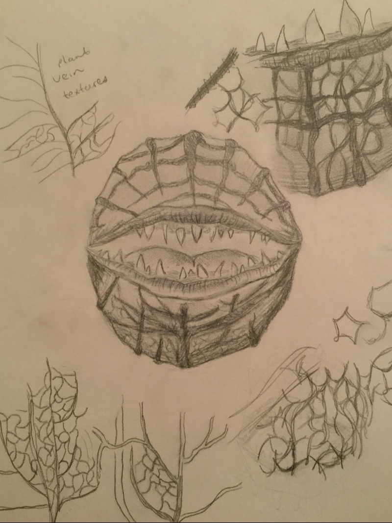
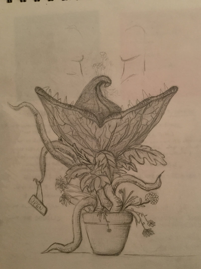
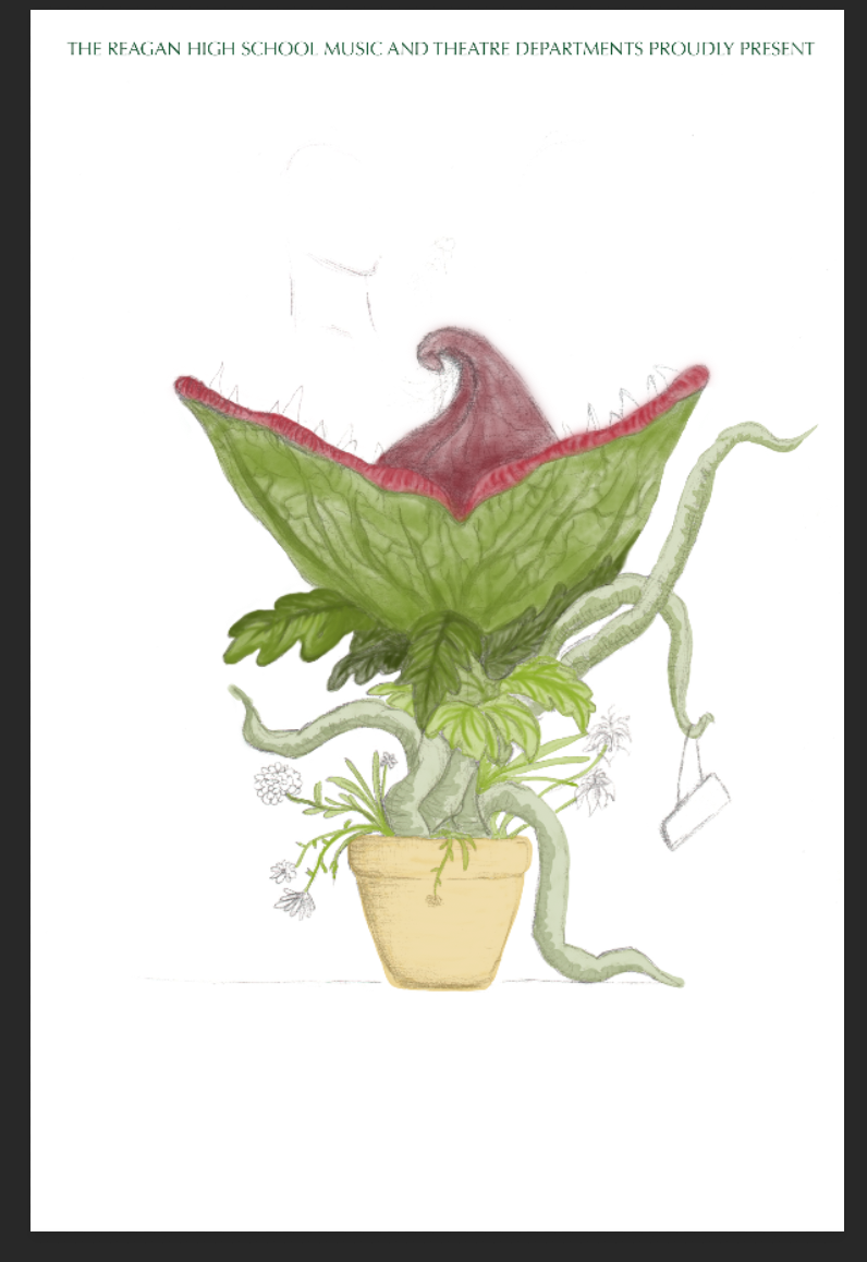
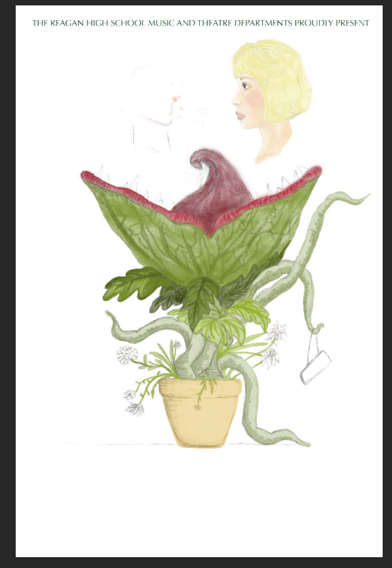
Weisgard incorporates not only strong blending and shading of hues, but utilizes texture to enhance his subject matter. The leaves have smooth, veined patterns and the grass is splotchy and patched in a more abstract manner while clearly still resembling grass and ground covering. There is a subtle effect of staining color that characterizes his style. I was inspired by the playful arrangement of subjects and the soft color scheme. It adds excitement and visual elements to the story being told alongside them, which was my goal as I depicted the story of Little Shop of Horrors. In the musical, a man named Seymour find and nurtures a strange plant that he soon discovers needs human blood to survive. As the plot line progresses, the plant (named Audrey II, after a girl named Audrey he falls for) grows larger and needs to consume more blood to sustain itself. Eventually, some people are killed and eaten within the plot. For those who have not seen Little Shop of Horrors, I captured the questionable idea of the blood-eating plant, Audrey II, consuming some of the characters. To display this. I decided to illustrate a large Audrey II, clearly overflowing it's pot, facing upwards with its mouth wide open. Since the birth of the plant is what seems to be drawing Seymour -- the owner -- and a beautiful lady named Audrey together, I drew the plant's tongue stretching upwards holding up a variety of flowers ripped from its own pot. Audrey and Seymour's side head profiles are placed in their side of the flowers, facing one another. They are floating directly over the plant's open jaws, indicating the weird kind of deathly trap they are being lured into by the present of the plant (both physically, socially and economically). I then used Weisgard's childish, bright color scheme and created some of the visually intriguing textures within the scene I constructed.
Planning
|
|
|
|
Process, Technique & Experimentation
The content of my poster I wanted to incorporate key elements of the production itself. I decided to create a depiction of the viscous plant, Audrey II, and two of the main characters (Audrey and Seymour). While using a stylistic approach that was inspired by the colored illustrations of Weisgard, I decided that I would take a digital approach and learn how to illustrate via the computer.
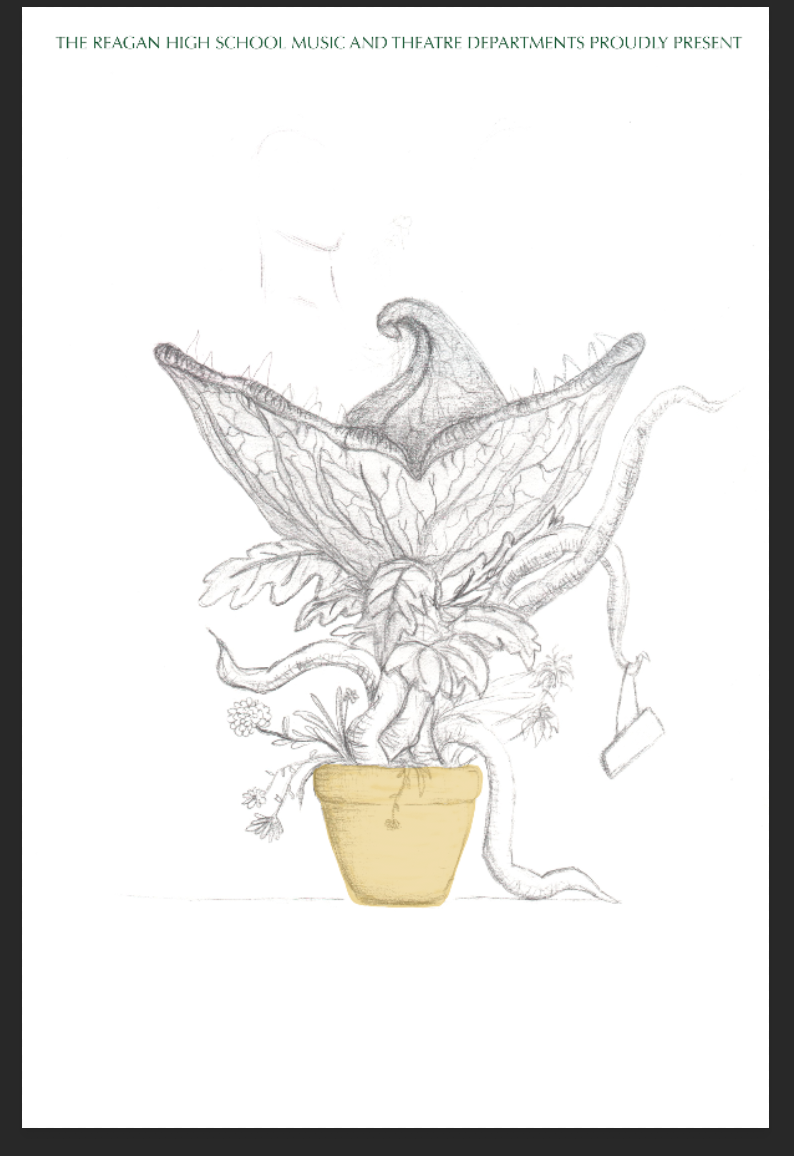
I was able to combine both hand-drawn elements with digital manipulation. The detail of the plant was a foreign approach for me, so part of my planning was researching different ways to portray the plant texture and the veins. I created a final, detailed sketch of how I wanted the large plant, Audrey II, to look. I then sketched Audrey and Seymour (the main characters that end up falling in love) a few different times in order to get used to the way their faces were structured. I chose a create side profiles in order the depict them looking at one another. I then took my final sketch of Audrey and Seymour and the sketch of the plant and scanned both separately onto a computer. I decided to incorporate the actual sketches into my final digital illustration, so I pasted them onto a Photoshop template. They were sized, cropped and positioned accordingly so that the two profiles were floating directly over the open mouth on either side of the tongue extending from the plant's mouth. From here, I continued to compile digital layers on top of them. They were used as a basic structural support for my design. I kept the physical shading on the scanned images within the sketch to enhance the color use that would overlap it later on. The first layer I added was strictly to color the plant. This included the head, the body, arms, lips and tongue. I spent several hours experimenting with the options available to me. I eventually settled on a very light opacity ( %) for the green hues. I wanted the scanned image to bleed through the layers of color to provide interesting textures and minimal shading.
I was able to combine both hand-drawn elements with digital manipulation. The detail of the plant was a foreign approach for me, so part of my planning was researching different ways to portray the plant texture and the veins. I created a final, detailed sketch of how I wanted the large plant, Audrey II, to look. I then sketched Audrey and Seymour (the main characters that end up falling in love) a few different times in order to get used to the way their faces were structured. I chose a create side profiles in order the depict them looking at one another. I then took my final sketch of Audrey and Seymour and the sketch of the plant and scanned both separately onto a computer. I decided to incorporate the actual sketches into my final digital illustration, so I pasted them onto a Photoshop template. They were sized, cropped and positioned accordingly so that the two profiles were floating directly over the open mouth on either side of the tongue extending from the plant's mouth. From here, I continued to compile digital layers on top of them. They were used as a basic structural support for my design. I kept the physical shading on the scanned images within the sketch to enhance the color use that would overlap it later on. The first layer I added was strictly to color the plant. This included the head, the body, arms, lips and tongue. I spent several hours experimenting with the options available to me. I eventually settled on a very light opacity ( %) for the green hues. I wanted the scanned image to bleed through the layers of color to provide interesting textures and minimal shading.
Reflection
This was a very time consuming project. I have never used digital illustration before, so this took a lot of trial and error in order to learn the nature of the technology. It required a lot of experimentation as I learned how to color, shade, and construct drawings without any paper or pencils. However, to guide myself, I was able to combine both hand-drawn elements with digital manipulation.
I learned the importance of layering, so in the event that I was unsatisfied with the contents of a layer or needed to delete one, it would not disrupt too many other components of the illustration itself. I discovered it was a lot more flexible than the approach of physical art work, in which colors cannot be undone or removed. Taking the time to explore in-depth and use this technology was very eye opening to me, and all the different possibilities that are available. Digital illustration allows for a lot more experimentation and error while making a final product -- I've never been able to press "backspace" or "delete" on a final art piece before.
Something I experienced difficulties with was keeping track of the layers and remembering to travel back and forth between them as I noticed little things I wanted to tweak, erase, change or blend better. There is so much opportunity for manipulation and change within a digital illustration that sometimes I found myself jumping around so much that I would begin coloring on the wrong layer, meaning that if I ended up wanted to blend certain elements, they would not blend due to being on different layers. This restricted me in some aspects, as I was not able to easily go back and correct certain things. Over all this project, while taking dozens of hours to complete, was quite rewarding. I was satisfied with the skills I was able to develop throughout this process, as well as the final product which is now being used to display our upcoming school production.
ACT Responses
Clearly explain how you are able to identify the cause effect relationship between your inspiration and its effect on your artwork?
I am able to identify the cause-effect relationship between my inspiration and its effect upon my artwork by analyzing the bright, pastel color scheme and approach to texturing, that creates a childishly happy appeal.
What is the overall approach the author has regarding the topic of your inspiration?
Da Vinci's approach to his collection of sketches (anatomy, portraits, animals) is create a simple, roughly realistic portrayal. I was inspired to use this as the foundation of my work. Weisgard's illustrations were filled with warm hues and applicable textures to subject matter (i.e. veins on leaves, folds in clothing), which I used as a detail focus in my poster.
What kind of generalizations and conclusions have you discovered about people, ideas, culture, etc. while you researched your inspiration?
Alice In Wonderland began as a hand-drawn book, that has evolved in various ways over time. Many different versions in which different illustrators recreated the visual elements within the story. The more adapted versions I came across during my research, the more I realized the context of this series of illustrations allowed for a lot of play in what types of depiction, styles, and level of detail were used. I focused on the warm, colorful illustrations by Weisgard.
What is the central idea or theme around your inspirational research?
The central theme of my inspirational research was directed towards which visual elements (color, texture, and space) would best portray the emotionally thematic components of Little Shop of Horrors. Due to there being both dark concepts (death, deceit, abusive relationships) and light-hearted humor (talking plant, plants taking over the world, ditsy characters), I looked to express both of these through the composition. The color scheme and texture was used to express the comedic, upbeat nature of the musical. The positioning and use space was to depict the darker elements (heads floating over an open mouth, faces with worried gazes facing each other).
What kind of inferences did you make while reading your research?
The choice of color arrangements within artwork can heavily impact the interpretation of theme, and the essential emotions extracted from it. The brighter and happier the illustrations, the more positive perspective the images seem to have. More simplistic with duller, more condensed range of color used leads viewers to interpret Alice In Wonderland as a darker tale.
Bibliography
https://theartstack.com/artist/leonardo-da-vinci/head-old-man-and-yout
https://www.biography.com/people/leonardo-da-vinci-40396
https://www.leonardodavinci.net/portrait-of-Isabella-deste.jsp
https://www.louvre.fr/en/oeuvre-notices/portrait-isabella-d-este
https://www.theatlantic.com/entertainment/archive/2011/11/leonard-weisgards-stunning-1949-alice-in-wonderland-illustrations/248012/
