Yellow Passing
Yellow 1
|
Yellow 2
|
Title of Set: Yellow Passing
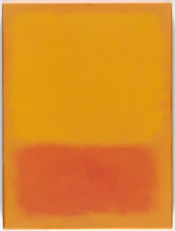
Size: 24 in x 30 in (2) Medium: Acrylic and Newspaper on Canvas Completion: August 2018 Yellow 1 and Yellow 2 explore the fine line between different shades of yellow, and how they reflect various levels of stability, health and emotion. I was inspired by the richly emoted Untitled by Mark Rothko to characterize shades of yellow as different levels of acceptance with death, as well by Van Gogh's dominant use of yellow in his works and the theories that have arisen from it. My research was guided by color study from Great Course’s How Color Affects You: What Science Reveals. |
Inspiration
Color is an essential component to human nature, and how we navigate and interpret the world around us. Like all other colors visible to the human eye, yellow can influence our behavior, thought patterns and emotions. It is a primary color, that in rich golden shades encompass happiness and in sour, saturated states reflect sickness and death. Yellow in the wrong shades is the color that, when worn, can make the person the most unattractive. No other color can worsen the appearance of a person as much as yellow, because it reflects a sign of sickness or impurity.
|
Mark Rothko was generally considered an abstract expressionist, and was deeply connected to the powerful emotions that could be summoned through the presentation of color. He created Color Field paintings, which are characterized by their lack of central focus, absence of objects, and emphasis strictly on color & its ability to capture the essence of spirituality. While the work is visually simple to take in, its dominant presence and tension between hues creates an overwhelming sensation. Rothko's intentions were to summon the most powerful and elemental emotions, such as experiences of euphoria or despair. I was inspired by his conduct of emotion through color, particularly in Untitled, created in 1968. It merges various calming variations of golden-yellow, which inspired my first painting in the set. I chose yellow, a powerful color, to express death and acceptance. As I deliberately contemplated the feeling I associated between the color and my own emotions, I was able to map out viewpoints of death in shades of yellow, with the bookends of the spectrum encompassing warm golden hues (peaceful, accepting) and sickly jaundice hues (anxiety, grief). I was also inspired by the intriguing approach to the blending of hues, to utilize a similar technique in my own work.
|

"Untitled" by Mark Rothko (1968)
|
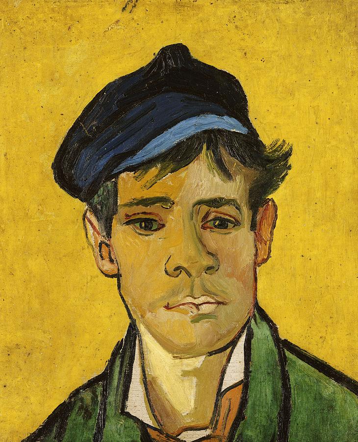
"Young Man With a Cap" by Vincent van Gogh (1888)
|
Vincent van Gogh was a Dutch post-impressionist who's works have been noted for their extraordinary containment of colors. While his creations were outstanding and intriguing, his personal life remained quite the opposite. Van Gogh committed suicide at age 37, a tragically short end after battling with his own dominating, self-destructive nature. Yellow is a color that can resemble the sun and other peaceful objects, but also can reflect anxiety and turmoil. There are various theories that have come about regarding him, due to the overwhelming presence of yellow in many of his paintings. For example, Young Man With a Cap is a portrait in which the jaundiced yellow melts from the man's skin into the background, creating an uncertain presence of health. Sunflowers is also painted in almost all various shades of yellow. It had been said that perhaps he had a 'yellow vision.'
|
|
Xanthopsia is known as an intruding influence of yellow that ultimately acts as a lense, tinting the normal perception of color in one's vision. It can be brought on by various disorders or induced by the intake of certain substances. Due to Van Gogh's unstable mental state, it has been concluded that he may have been prescribed certain medications that have proven the ability to cause Xanthopsia. The theory remains a theory as the inquiry still endures, whether Van Gogh had painted what he had seen through a yellow vision, or if it was deliberately stylistic. Nonetheless, his works have always maintained a peculiar inclination for yellow. This inspired me to approach death, anxiety and acceptance through a yellow lense in my pieces-- the figures, the environment and everything in between in shaped by strictly golden or sallow hues.
|
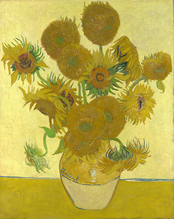
"Sunflowers" (fourth edition) by Vincent van Gogh (1888)
|
Planning
My framework of planning included the creation of a few human forms through sketch. Since death is a very elemental concept, I ultimately chose to exclude any distracting features of accessories or clothing on the figures.
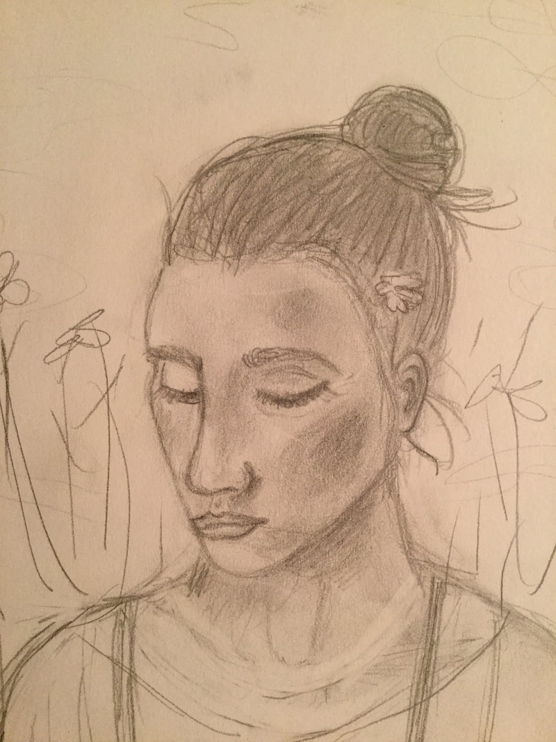
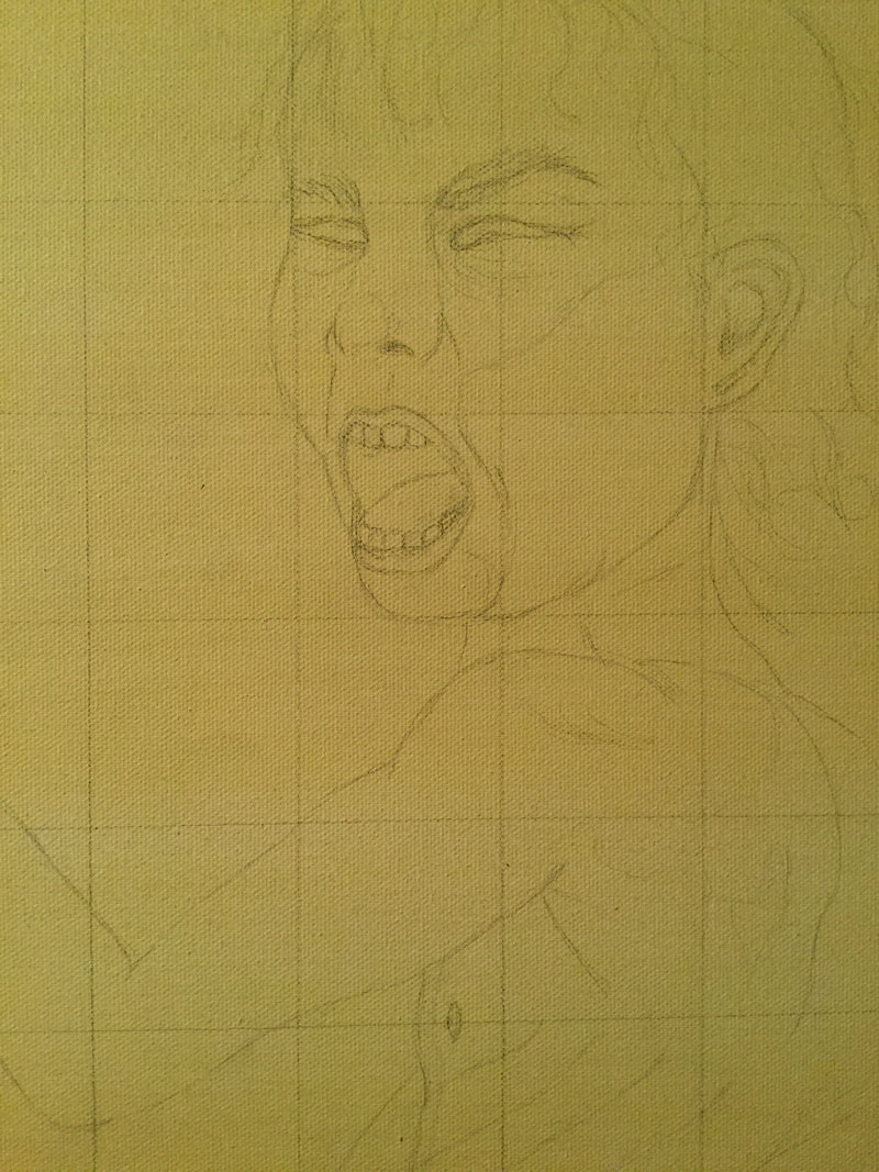
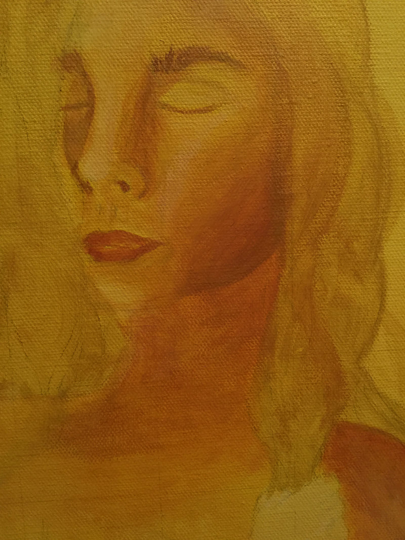
First sketch: head portrait included various accessories, objects and clothing. Created for the peaceful, golden-yellow themed painting. Was unsatisfied by the distraction of other objects from the figure herself.
|
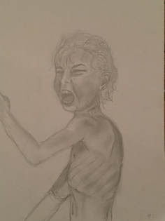
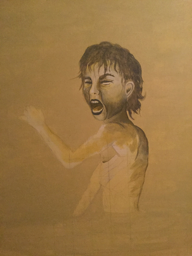
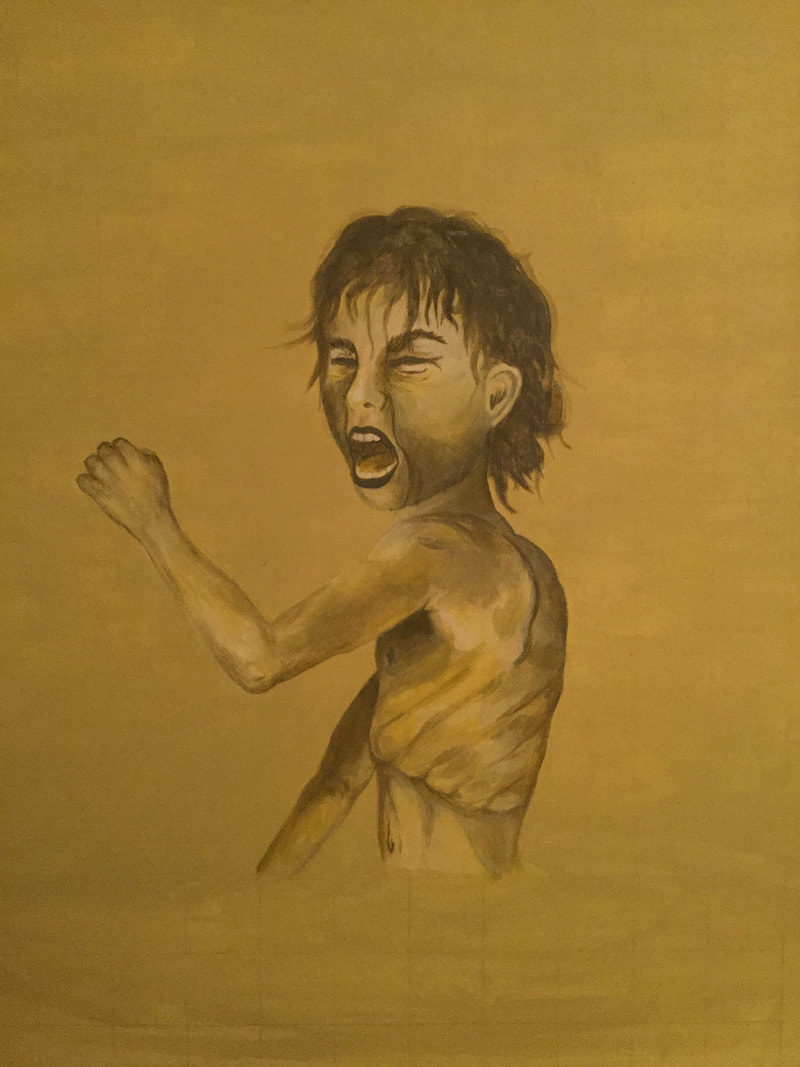
Second sketch: focus on planning for the second sallow, jaundice yellow painting. Omitted the usage of clothing or objects. Expanded viewpoint to include more of the body; allow for more depiction (positioning, health). Expression of grief, moderately unhealthy appearance to enhance the sickly shade of yellow that will be used.
|
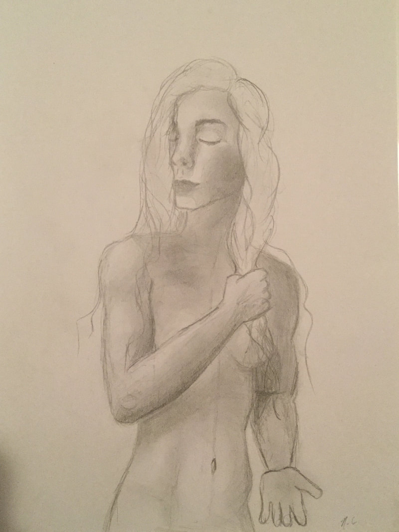
Third sketch: another planning for the peaceful, golden-yellow painting. Shows bare figure down to waistline. Soft shading, calm facial expression and a non-violent positioning enhance the serenity of this shade of yellow.
|
Utilizing the spectrum of yellow shades, I was able to create the greenish yellows that are anxiety-filled and sickening. They contrasted with the creation of the warm, golden yellows that reflect peacefulness and comely beings. These became the staples of my individual paintings in Yellow Passing. The expression of the figures are meant to emphasize the feeling of each shade of yellow respectively.
Process, Technique & Experimentation
|
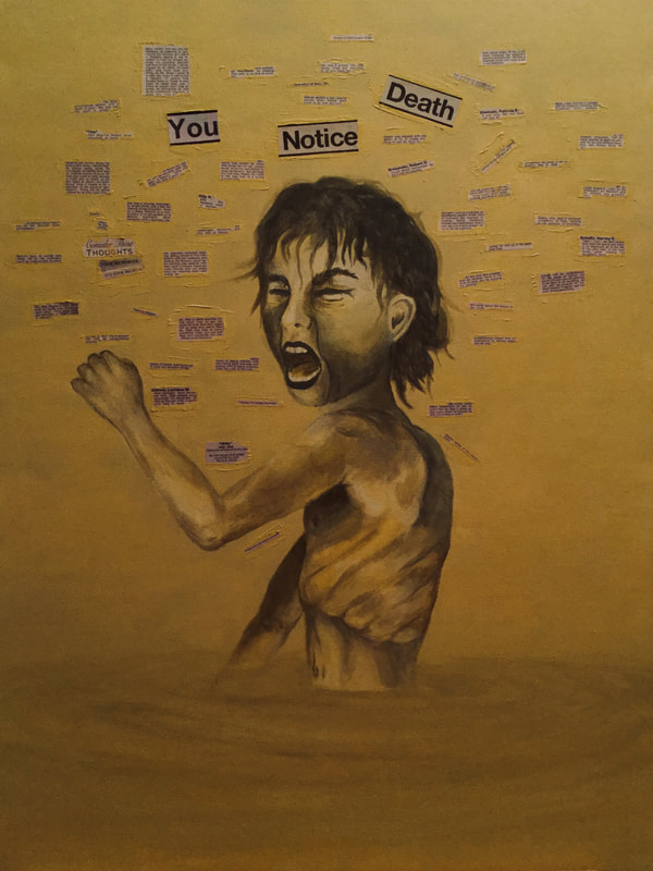
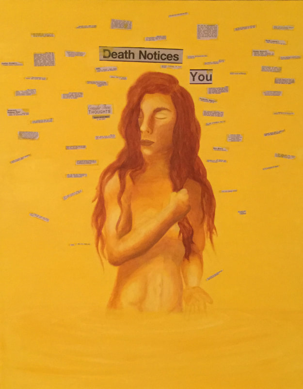
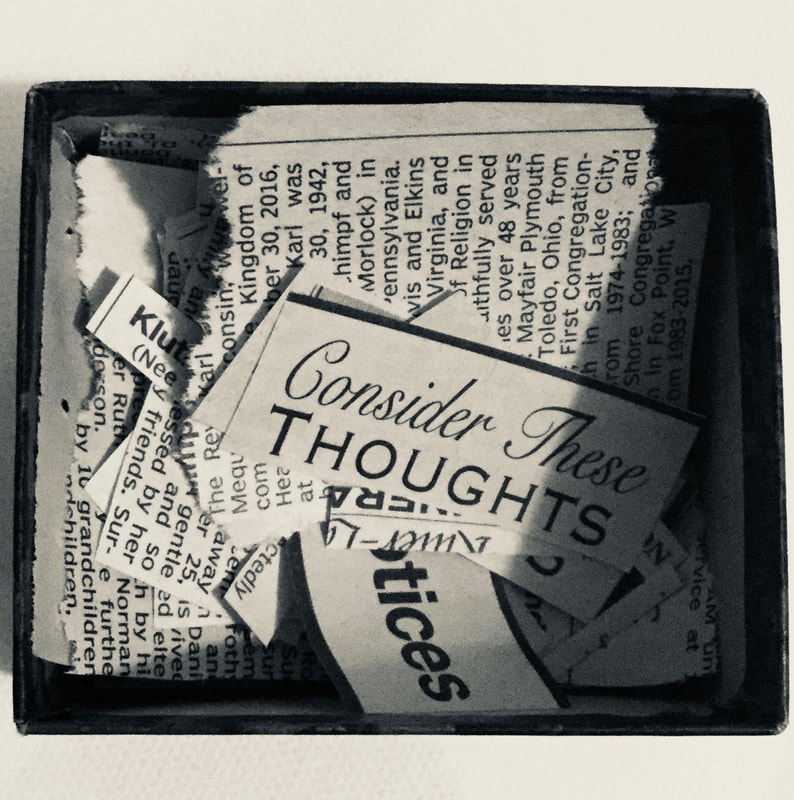
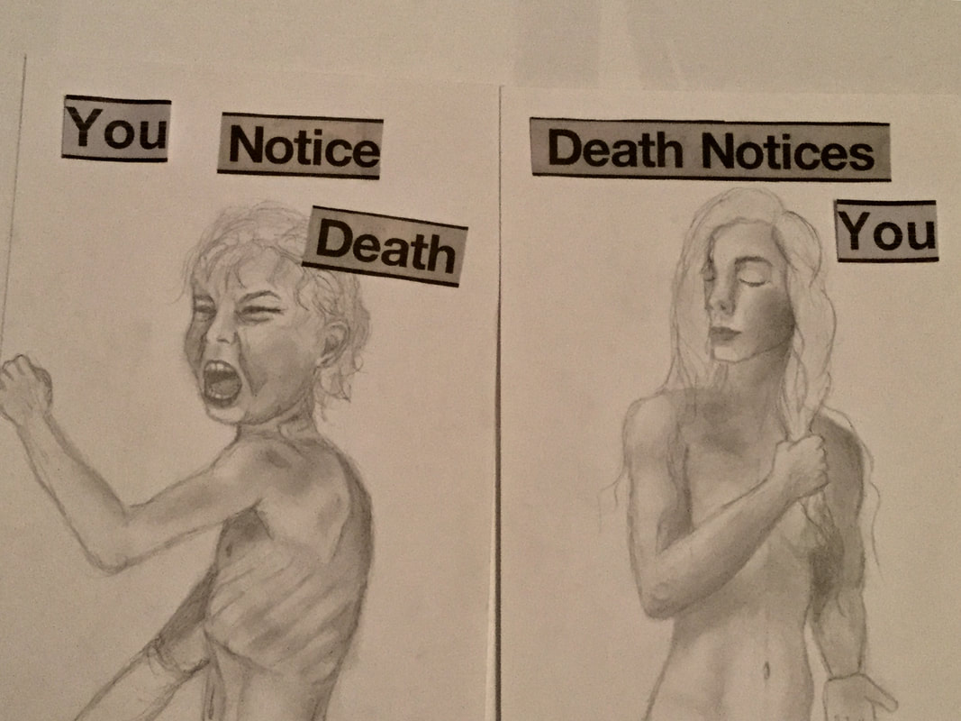
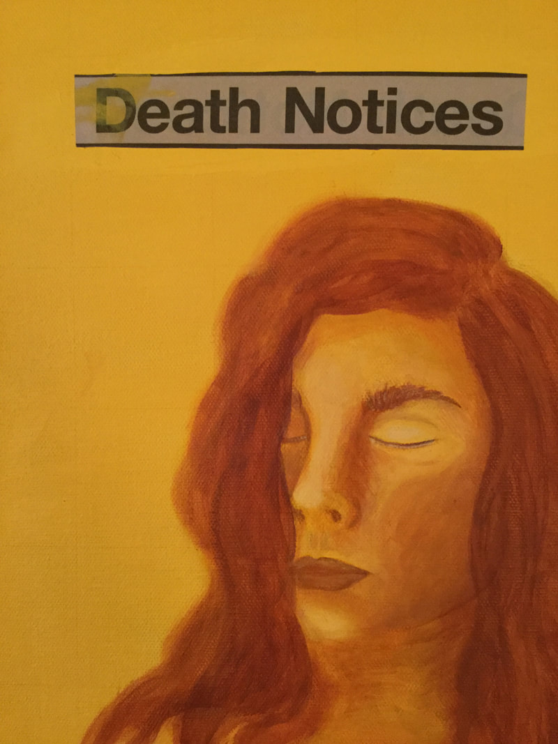
After my planning sketches were completed, I was almost immediately inspired to play with experimentation. This summer I have watched many people pass away, and as a result from attending funerals collected various memory and prayer cards. Death has always been prominent in my life, and so I often go through the death notices in the newspapers when I have access to one. I am acutely aware that no one reads through this section out of interest, let alone read about dead strangers, and is only referenced by a few people a week to read about someone they knew. Some of these write ups are extremely heartfelt, heart wrenching and honest. There is a peculiar beauty to memorializing someone you love. It is also difficult to read the very short, blunt informational snippets in which it is quite obvious the person wasn't well known or cared for. As certain sentences struck me, I began to cut them out. As I did, I began to categorize them in one of two ways: how we notice death within those around us or within ourselves, and how death notices them or us.
|
When we notice death, it causes us to notice all the extraordinary things about the person who has passed away, the beauty to their existence, their habits and what they shared with the world. Everyone is a different collection, characterized like none of the others. On the other hand, death notices us. Death tells the other end of the story, the ways in which it took them away, the lingering pain amongst loved ones, the way their passing has shifted so many lives. It causes us to notice sometimes the extreme pain and difficulty they may have faced themselves, battling to survive, or perhaps an unfortunate accident. Death notices our difficulty in parting, physically and emotionally.
|
I cut out various quotes, and the headlines of the newspaper section: DEATH NOTICES. I mimicked to the best of my ability the font and coloring of the text, and typed up and printed out the missing word for my project, "YOU." I then paired each statement with one of the paintings, according to the emotion of the yellow. Sallow yellow is the cruelty and anger we have accepting death, when we notice it and the beauty is subtracted from our world. Warm, golden-yellow is the peace and acceptance of our own passing and the passing of those around us, as death notices us, and the painful removal of life. I saved the sorted quotes and snippets of writing from the passages My new challenge through experimentation would be incorporating them directly into my paintings.
|
|
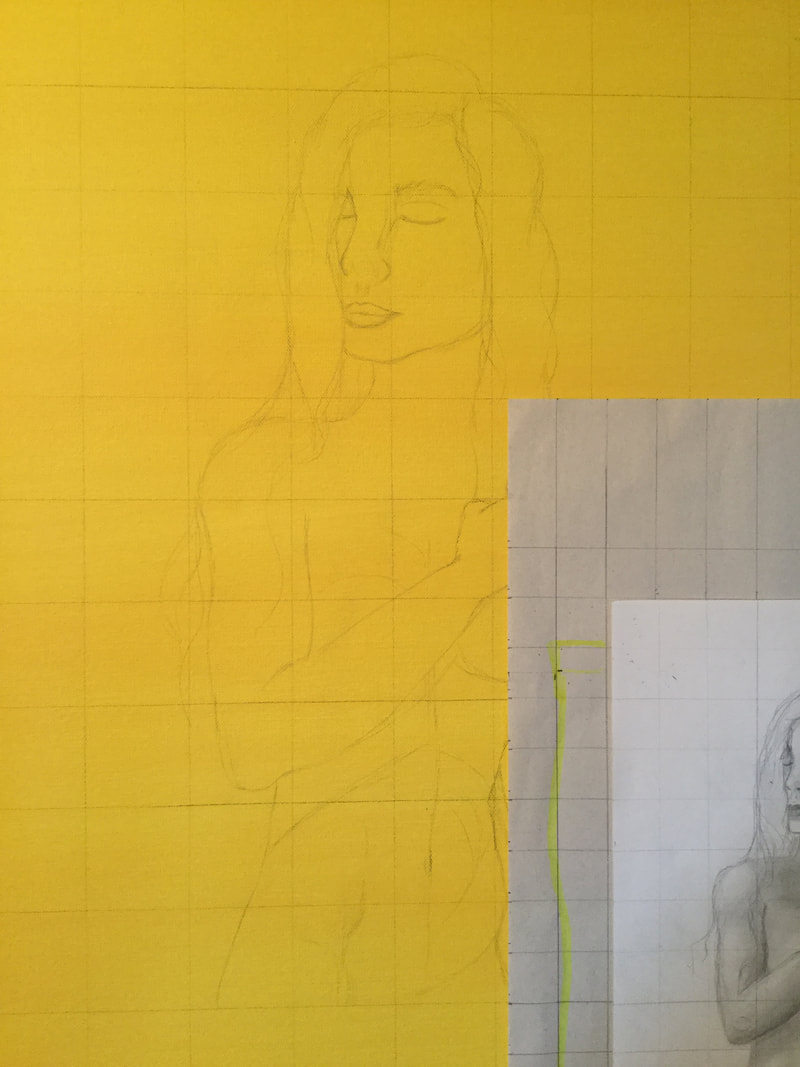
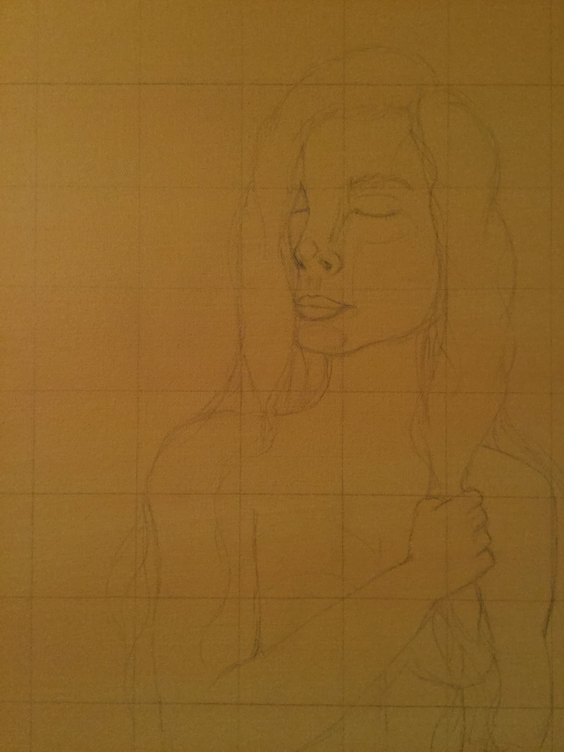
My two canvases were already pre-gessoed. I created my two distinct shades of yellow, and gave a wash to each canvas respectively (jaundice yellow, golden yellow). This was extremely important, and mimicked my inspiration of Color Field paintings. I washed both canvases in yellow. Along the way I decided that the submersion of yellow was the most critical aspect of the piece, and wanted the figures centered on the canvas, not cropped all the way to the edges of the panel of view. To adjust accordingly, I took larger sheets of paper and measured out the length and width. My canvases are both 24 x 30 inches, so I cut the papers so that they were 12 x 15 inches, precisely half the size of the canvas. I then used the grid method to sketch out lines across my original sketches, and the blank papers. I taped the sketches, centered, onto the larger papers. This way I could provide room below the figures for the yellow water I chose to incorporate. Each square was 1 x 1 inch. Since the canvas was exactly one size larger, I measured out and sketched a grid across both, with each square the size 2 x 2 inches. Carefully, I reproduced the final sketches onto the canvases following the placement within the squares.
|
|
|
|
Based on the original shading I produced in the sketches, I then recreated both images through painting with yellow. I began with largely emphasized highlights (yellow, whitened) and shadowing (yellow, added brown or black accordingly) along the figures. I began to then blend over these highlights as I contributed the the growing presence of form and curvature. Some areas were emphasized as more realistic, others were left more dominantly dark or light as a form of emphasis-experimentation (such as lips, eyes, and hair). The approach to stylistic brushwork was inspired by the Color Field paintings, and the way the colors seemed to blend both smoothly and roughly for a hazy effect, almost like a sunrise. Sometimes this required me to use the motion that mimics coloring and shading with pencils, to allow colors to blend in a particular way. Although utilizing the same primary color, I strictly kept the shades in a smaller spectrum that differed from the other -- sallow yellow and golden yellow. Lastly, I incorporated the pooling yellow water around the lower half of the body where it disappears into to saturated color. I used a different approach with my painting technique, in order to better mimic the effect of rippling water. Essentially, after recreating the same color as the background, I created two color strands from it: a highlight, to which white was added to the original color, and a shadow, to which brown or black was added. I used sweeping motions to create half ovals around the waist of the figures that gradually spread wider and wider until they reached the edges of the canvas. As I did this, I switched between the base color, the highlighted version and the shadowed hue. This allowed for the general portrayal of water. This concluded my painting process.
Once the paint dried, I began to experiment with the material I had collected. The newspaper clippings are all various sizes and lengths depending of how in depth the message or statement was that stood out to me. I created again a large amount of the color that matched the primer color of each canvas respectively. I would try and use the paint to stick the death notices onto the canvas. The effect I wanted to create was like messy paper mache, using copious globs of paint that surrounded each piece of text. As I began working on Yellow 1, I noticed that my lack of strategy began to take on a portrayal of its own. The words seemed to hang around the boy's head like a swarm of bees, which significantly contributed the the tone of the piece. This inspired me to experiment with Yellow 2, in which I did strategically plan the placement of the newspaper clippings. This time, to oppose the effect of the first painting and support the calm nature it had, I scattered the texts to mimic the concept of falling rain. It was further symbolic of the ideas I already had as a foundation.
Once the paint dried, I began to experiment with the material I had collected. The newspaper clippings are all various sizes and lengths depending of how in depth the message or statement was that stood out to me. I created again a large amount of the color that matched the primer color of each canvas respectively. I would try and use the paint to stick the death notices onto the canvas. The effect I wanted to create was like messy paper mache, using copious globs of paint that surrounded each piece of text. As I began working on Yellow 1, I noticed that my lack of strategy began to take on a portrayal of its own. The words seemed to hang around the boy's head like a swarm of bees, which significantly contributed the the tone of the piece. This inspired me to experiment with Yellow 2, in which I did strategically plan the placement of the newspaper clippings. This time, to oppose the effect of the first painting and support the calm nature it had, I scattered the texts to mimic the concept of falling rain. It was further symbolic of the ideas I already had as a foundation.
|
|
|
|
Reflection
This project was highly characterized by my incorporation of experimentation. My original plans were amplified as I went along, as I continued to build in more techniques and symbolism. Overall I was quite satisfied with my set of work when it was complete. One of the difficulties I faced when creating these was that they were both (purposely) composed of strictly yellow. This required me to make copious amount of paint in the same hue, so when I ran out or came back to another section of the painting that required the same base color, I had to work hard to match the original. Needless to say, I went through a lot of yellow paint. The grid method was also a lengthy process, especially since part of my experimentation included moving the figures to the center of the painting, which required the graphing of the sketches to be re-worked. A lot of the time-consuming components I had to embrace if I wanted to follow the flow of my various points of experimentation. The figures themselves required lots of attention to blending as I was ultimately inspired by the transitioning of color within Rothko's Color Field paintings. My own technique tended to stay more inside the lines so to speak, as a preference. The abstract incorporation of water at the bottom of both paintings resulted quite well, being my first time attempting to paint the presence of water in a scene. I enjoyed incorporating a different set of material into my work. One of my goals that came about as I was designing these works was to create something that people had to stop and look at, in this case read, in order to experience more of the creation itself and the message it imposes.
Compare and Contrast

|
Similarities
|
|

|
Similarities
|

|
ACT Responses
Clearly explain how you are able to identify the cause effect relationship between your inspiration and its effect on your artwork?
I am able to identify the cause-effect relationship between my inspiration and its effect upon my artwork by analyzing the intentional use of various shades of color to summon emotion or create symbolism.
What is the overall approach the author has regarding the topic of your inspiration?
Rothko's approach to his Color Field paintings was to evoke the strongest emotions possible in a seemingly simple, abstract creation composed of color arrangement in elemental shapes. Van Gogh utilized saturated, vivid hues to characterize objects or people which emphasizes their state of stability.
What kind of generalizations and conclusions have you discovered about people, ideas, culture, etc. while you researched your inspiration?
Color impacts the human condition and perception in innumerable ways and is critical in portraying the current state of being
(physical/mental health or deterioration, emotion, etc.). In addition, the study of color has allowed the relationship between van Gogh's suicide and his bodies of work to produce various intriguing theories.
What is the central idea or theme around your inspirational research?
The central theme of my inspirational research was the use of yellow in portrayal of basic human emotions and the way they can be seen through the experience of death, loss and acceptance.
What kind of inferences did you make while reading your research?
Rothko's Color Field paintings are blended in a unique way that appears very basic and lacking in-depth technique, but the blurred lines between hues creates the effect of a sunset, dusk, and other abstractly elemental experiences removed from a realistic scenery. It ultimately then leaves a rich presence of emotion.
Bibliography
- Lidwell, William. “How Colors Affect You: What Science Reveals.” The Great Courses, 10 Sept. 2018, www.thegreatcourses.com/courses/how-colors-affect-you-what-science-reveals.html.
- Gruener, Anna. “Vincent Van Gogh’s Yellow Vision.” National Center for Biotechnology Information, U.S. National Library of Medicine, July 2013, www.ncbi.nlm.nih.gov/pmc/articles/PMC3693787/.
- “Mark Rothko.” Museum of Modern Art, www.moma.org/artists/5047.
- “Mark Rothko Untitled (1968).” Museum of Modern Art, www.moma.org/collection/works/37042?artist_id=5047&locale=en&page=1&sov_referrer=artist.
- “Young Man with a Cap, 1888 by Vincent Van Gogh.” Vincent Van Gogh, www.vincentvangogh.org/young-man-in-a-cap.jsp.https://www.thoughtco.com/color-field-painting-art-history-183314
- “Sunflowers.” Totally History, 22 May 2013, totallyhistory.com/sunflowers/
