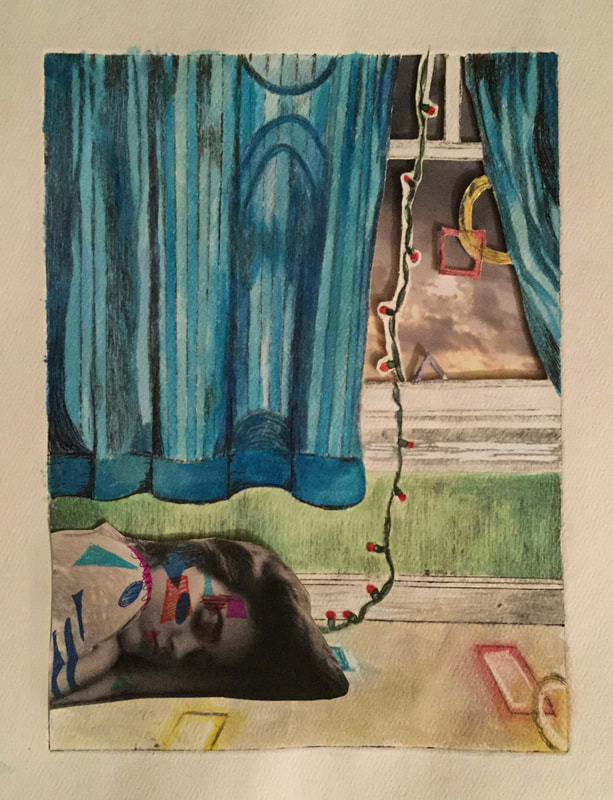
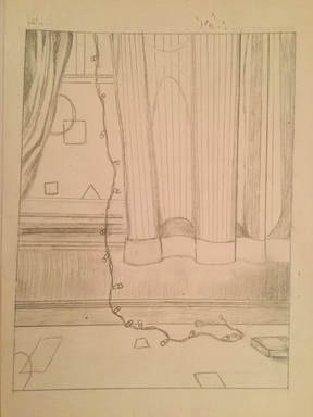
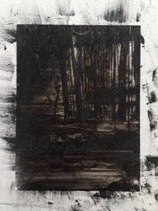
Are We Home Yet?
|
Size: 8 in. x 6 in.
Medium: Dry Point Completion: September 2018 The intention of my drypoint was to create the visual and emotional sensation of being home. It combines the elements of an imprecise, abstract architecture portrayal and heavy reliance on basic shapes inspired by Clare Caulfield's Lexington Avenue NYC, to symbolize the fundamental and structural components of being in a safe space. The incorporation of photographic images into this piece was inspired by Robert Rauschenberg's Port of Entry. |
Inspiration
|
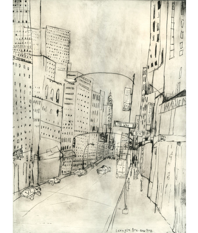
Clare Caulfield is a modern artist and printmaker. Her work is characterized by her dominant attraction to cities, man-made structures and travel. Her inspiration and passion stems from architecture, often in broad panels of view that include various complex structures. Many of her prints are designed in the world's greatest cities. She is a consistent traveler from which her artwork results from, often being away from home. Caulfield recreates vast, busy-city scenes in a sketchy, simplistic style. It captures the essences of the structures, while incorporating minimalistic detail in a elemental approach. Shape and line in her work are purposely left without precision, which allows for a distinctive, playful effect. Buildings do not stand up straight, and cars mimic children's toys, yet it is still evident that it is a real scene. Her personal stylistic choices allow each print to build into a unique portrayal of the view she captures. I was inspired by Caulfield's Lexington Avenue NYC, to utilize the portrayal of architecture, along with her technique in which the abstract element of her work ultimately breaks down real life into imprecise shapes. Instead of a broad scene, I wanted to narrow down the scene to a certain part within a structure. Her work is centered around travel, and so in contrast my desire is to portray the feeling of home.
|
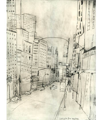
"Lexington Avenue NYC" by Clare Caulfield
|
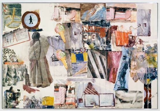
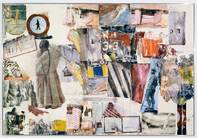
"Port of Entry" by Robert Rauschenberg (1998)
|
Port of Entry is a piece created by Robert Rauschenberg, that is part of a series he created, Anagrams (A Pun). Aside from his previous approaches to his work that included silkscreen prints and transfer drawings, Rauschenberg began to utilize a new, more developed method in 1991 in order to create his art; the inclusion of photography within his paintings were printed on transparent sheets. In particular, Port of Entry delves into the concepts of travel, journey, and home. It explores the aspect of distance from home, and all the pieces in between. Along side this enveloping theme, this creation is a part of a series that has a major focus on communication. The concept of anagrams (rearranging the letters in a word or phrase to say something new) is applied in an abstract manner to all the pieces that collage into a body of work, where he rearranged parts of photographic images.
|
I was inspired by the incorporation of specific pieces of photographs into a larger, more uniform piece. Both Rauschenberg and Caulfield had interesting elements that I mashed together to create a body of inspiration, dry points that would incorporate parts of my own photographic images.
Planning
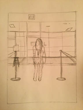
sketch 1 of a peaceful scene, the butterfly exhibit
|
sketch 2 of a peaceful scene, the warm window
|
Process, Technique & Experimentation
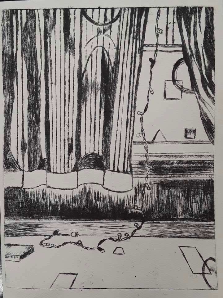
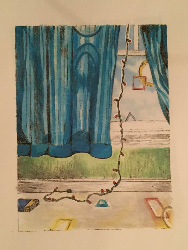
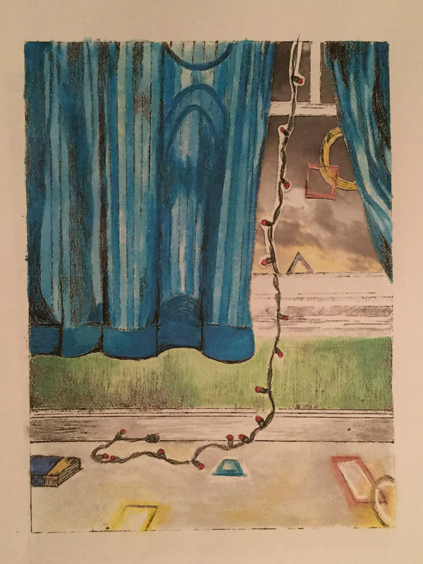
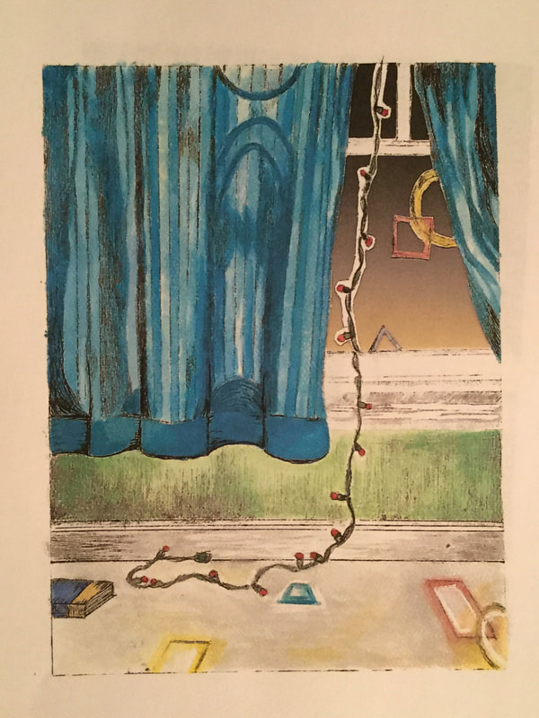
I wanted to recreate what home felt like, where home felt like, where there was peace. I went through old photographs to remember the design, color and feeling of the room. Home was with my old best friend. Her home felt like home, the cozy spot right beneath her bedroom window where the sunlight would heat the carpeting. It's where she used to fall asleep reading, where the dog would go to watch the world outside the window, where I found my heart home, where I felt safe. My goal was then to recreate the specific view of the peaceful window area itself. After obtaining the dry point sheets, I measured out the length and width (8 in. x 6 in.) and traced it accordingly into my sketchbook. Within the appropriate size perimeters, I was able to create my sketches.
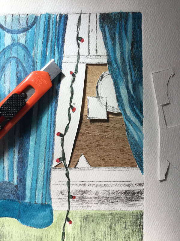
Once the final sketch was completed, I was able to begin the reproduction onto the dry point plate. This required scratching and carving into the surface itself. I taped the clear plate down directly over the final sketch and ultimately began tracing the pencil lines and shading with the pointed carving instrument. Where the lines are engraved are the spaces in which the ink will seep in -- every part that is carved will be the black area on the final product. The tip is small and fine, creating very thin lines. This allows for the effect of shading, which can be achieved though crosshatching or one-way lines. My piece was a combination of loose shading (free-sketched lines), while others required focus and slow movement. For some of the lines that built the frame of the window or the area where the floor meets the wall, I used a ruler to align the tip of the tool. This proved to be very difficult, as the the tool tended to stray away from the intended course of direction. I took a simplistic approach that utilized basic forms in which many mimic the general variety of shapes, so many of my lines stood alone and could not afford to mess up. Once the dry point was finished, I began to prep for making prints.
Once the final sketch was completed, I was able to begin the reproduction onto the dry point plate. This required scratching and carving into the surface itself. I taped the clear plate down directly over the final sketch and ultimately began tracing the pencil lines and shading with the pointed carving instrument. Where the lines are engraved are the spaces in which the ink will seep in -- every part that is carved will be the black area on the final product. The tip is small and fine, creating very thin lines. This allows for the effect of shading, which can be achieved though crosshatching or one-way lines. My piece was a combination of loose shading (free-sketched lines), while others required focus and slow movement. For some of the lines that built the frame of the window or the area where the floor meets the wall, I used a ruler to align the tip of the tool. This proved to be very difficult, as the the tool tended to stray away from the intended course of direction. I took a simplistic approach that utilized basic forms in which many mimic the general variety of shapes, so many of my lines stood alone and could not afford to mess up. Once the dry point was finished, I began to prep for making prints.
|
|
|
|
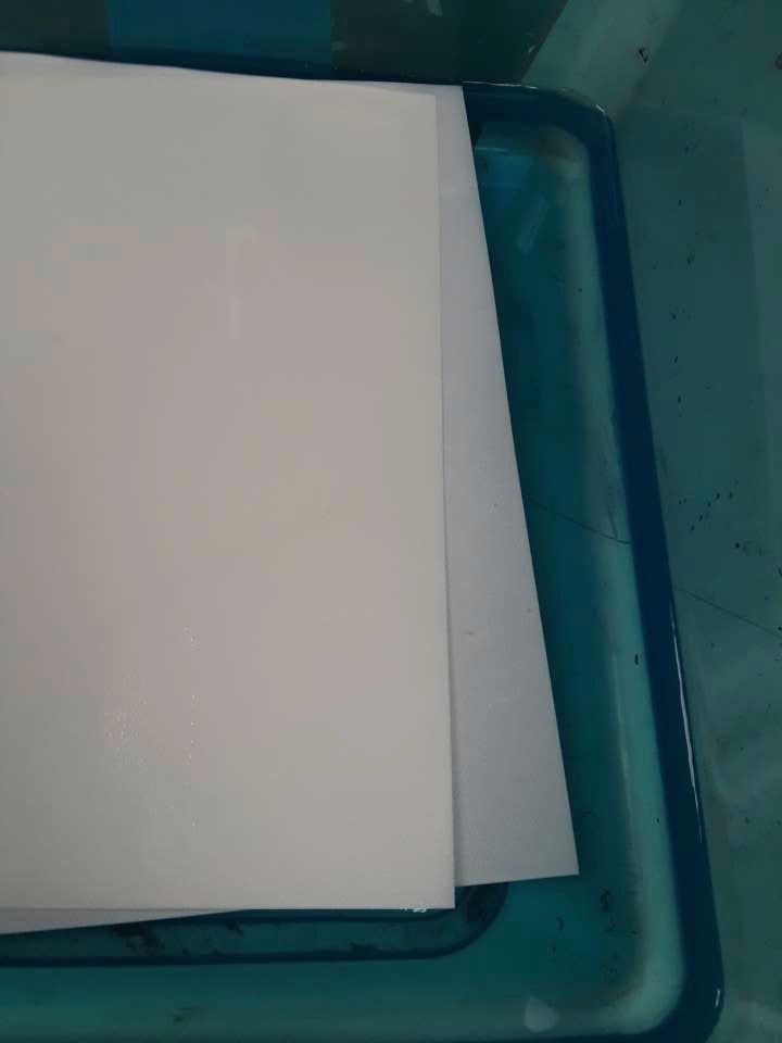
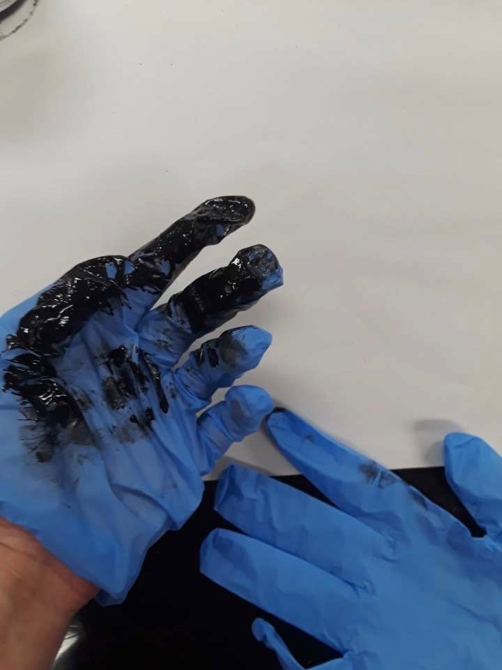
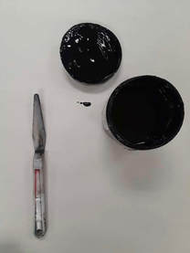
Watercolor paper was used, and the sheets had to be soaked in a small tub of water for approximately 8 minutes before used. While the paper was soaking, I gathered the oil based ink, a plastic palette knife, newspaper, and gloves. I placed my dry point plate with the etching face-up on a sheet of newspaper. Using the palette knife, I dipped it into the container of ink and then drizzled a small amount of it onto the face of the plate. With another piece of newspaper, I ripped the sheet into smaller sections and folded them into squares about the size of the palm of my hand. This flat surface I used to smear the ink over the entire surface. Once it had been rubbed into the etched lines, I then used clean squares of newspaper to rub off the excess ink that coated the plate. When it was completely rubbed down, the only ink remained resembled my sketch. I then removed my watercolor paper from the water and patted it dry with a towel so it didn't remain sopping wet. I then aligned the wet paper over the ink-filled plate so that it was centered. Still face-up with the paper on top, I placed it on the stone top and put it through the printing press. Removing the print, I then placed it on a rack to dry.
|
|
|
I had to experiment with the amount of ink used and how hard I rubbed off the excess, some prints came out dark and some lighter. I chose a lighter print after they had dried to begin to fill in. I used watercolor to add color to the bare print. I then used a box cutter to carve out the space where the window shows in the dry point. Then, I began to experiment with my incorporation of photography. In the area which I carved out the paper, I could now place behind it my own photography of the sky. In order to decide which view complied the best with the created scene, I printed out multiple photos on paper and cut them out. I then temporarily attached them to the back of my dry point and scanned them onto the computer in order to see all three choices at once. I then printed them out the experiment with the positioning and location of the sleeping figure photo. Lastly, I added shapes to the figure's face to more heavily concentrate on the present of elemental shapes floating into the room.
|
|
|
|
Reflection
This piece was an excellent way to explore various types of manipulation and interchanging ideas/characteristics. I had many ways to approach the design of scene, and I loved being able to deal with various aspects of experimentation. This came through the print itself, and the way I filled it in, which medium I used, and the color scheme I chose. By carving out portions of the paper itself, I was able to fill in the space from behind with nearly any scene I could capture through my camera. Each sky carries a different feeling and a different lighting. Lastly, the resting figure can come from either side of the scene (can be digitally mirrored) and allowed for me to play with the feeling and visual elements of balance. The initial process of scratching out the image onto the template proved to be a challenge. Being my first attempt, I was unsure of how deep / hard I should be scratching. Since I took breaks from the process, sometimes I would attack the piece lighter or softer than the last approach. Some areas were more heavily carved, and it shows in the final prints were these areas are naturally darker. When creating dry point, you can always carve out but you can't fill back in. Over all I was pleased with the process and product of this project.
|
Compare & Contrast
Similarities
|
"Port of Entry" by Robert Rauschenberg (1998)
|
Compare & Contrast
Similarities
|
"Lexington Avenue NYC" by Clare Caulfield
|
ACT Responses
Clearly explain how you are able to identify the cause effect relationship between your inspiration and its effect on your artwork?
I am able to identify the cause-effect relationship between my inspiration and its effect upon my artwork by analyzing the intentional use of various shades of color to summon emotion or create symbolism.
What is the overall approach the author has regarding the topic of your inspiration?
Rothko's approach to his Color Field paintings was to evoke the strongest emotions possible in a seemingly simple, abstract creation composed of color arrangement in elemental shapes. Van Gogh utilized saturated, vivid hues to characterize objects or people which emphasizes their state of stability.
What kind of generalizations and conclusions have you discovered about people, ideas, culture, etc. while you researched your inspiration?
Color impacts the human condition and perception in innumerable ways and is critical in portraying the current state of being
(physical/mental health or deterioration, emotion, etc.). In addition, the study of color has allowed the relationship between van Gogh's suicide and his bodies of work to produce various intriguing theories.
What is the central idea or theme around your inspirational research?
The central theme of my inspirational research was the use of yellow in portrayal of basic human emotions and the way they can be seen through the experience of death, loss and acceptance.
What kind of inferences did you make while reading your research?
Rothko's Color Field paintings are blended in a unique way that appears very basic and lacking in-depth technique, but the blurred lines between hues creates the effect of a sunset, dusk, and other abstractly elemental experiences removed from a realistic scenery. It ultimately then leaves a rich presence of emotion.
Bibliography
- Caulfield, Clare. “ABOUT.” Clare Caulfield - UK Artist and Printmaker, clarecaulfield.co.uk/about-clare/.
- Caulfield, Clare. “DRYPOINTS.” Clare Caulfield - UK Artist and Printmaker, clarecaulfield.co.uk/drypoints/.
- “Robert Rauschenberg, Port of Entry [Anagram (A Pun)], 1998.” SFMOMA, www.sfmoma.org/artwork/99.360.A-C.
- Feinstein, Roni. “Port of Entry [Anagram (A Pun)].” SFMOMA, July 2013, www.sfmoma.org/artwork/99.360.A-C/essay/port-of-entry-anagram-a-pun/.
